Themes
Brightspot separates content (text, images, videos) from presentation (how the content appears in a web page). You use the content edit form to manage content, and you use themes to manage the content’s appearance.
The following sections describe the various aspects of a theme.
Theme overview
Themes provide your site’s layout, color scheme, and behaviors. You can install your own themes, and versions of individual themes, into Brightspot.
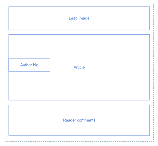
Page layout
A page layout specifies which elements are rendered in the published asset and in which order. The following diagram is an example of page layout for a published article.
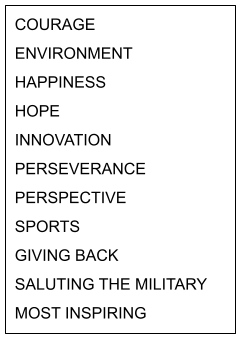
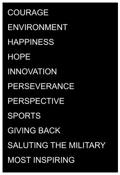
Styling
Styling specifies the color scheme, typeface, and general spacing between elements. Brightspot applies styling through traditional CSS files. The following illustrations are examples of styling that are almost the opposite of each other: one with black-on-white, the other with white-on-black.
 |  |
Behavior
Web pages have a variety of behaviors, such as animation and data validation. The following animation illustrates two behaviors that occur after a visitor clicks on the search icon:
- Exposes a search field.
- Places the cursor inside the search field (so visitors do not need to click into the field).
Behaviors are typically implemented using JavaScript.
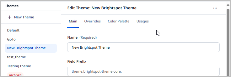
Uploading themes
This topic describes how to upload a theme to Brightspot.
You can create a new theme by copying an existing theme and then modifying it. For details, see Copying a theme.
To upload a theme:
- Click > Admin > Themes.
- Using the following table as a reference, complete the fields as needed.
- Click Save.
| Field | Description |
|---|---|
| Name | Enter a name for this theme. This name appears in Brightspot widgets. |
| Field Prefix | Enter an identifying prefix for this theme. When you apply a one-off theme to a site with this prefix, that one-off theme inherits styling from this theme. For example, if the field prefix is ABCD, and you then apply a one-off theme to a site with prefix ABCD, the site inherits settings from this theme. For more information, see Changing a site's theme. |
| Bundle | Select one of the following: New File—Allows you to upload a new theme bundle. Click Choose to select the theme bundle on your local storage. Note: The standard version of Brightspot comes with a theme bundle you can find at brightspot-go/frontend/styleguide/build/libs/frontend-styleguide.jar. Existing—Allows you to use an existing theme bundle. Click to select an existing theme bundle. |
Copying themes
You can create a new theme by copying an existing theme and then modifying it.
To copy a theme:
- Click > Admin > Themes.
- In the Themes widget, click the theme you want to copy.
- In the content edit form, click > Copy This Theme.
- Make any changes necessary. For information about the available fields, see Uploading a theme.
- Click Save.
Upgrading themes
Themes evolve over time. For example, your publication's marketing department may want to deploy a new color palette or change the site's overall appearance. Developers may need to correct bugs or deploy new behaviors available in modern web browsers. These changes are installed in Brightspot as upgrades to a theme.
To upgrade a theme to a new version:
- Click > Admin > Themes.
-
In the Themes widget, select the theme for which you want to install an upgrade.
-
From the Bundle list, select New File.
-
Do one of the following:
- Select New Upload, and navigate to the bundle file on your laptop.
- Select New URL, and paste the bundle's URL.
-
Make any other changes necessary. For information about the available fields, see Uploading a theme.
-
Click Save.
Brightspot delivers the theme’s upgrade as a CSS file that may already be in a browser’s cache. If visitors don’t see the upgrade, advise them to clear their browser’s cache.
Customizing themes
You can customize a theme's color scheme, fonts, and some layout elements to match your site's branding.
The following tables describe the available theme customizations.
Colors
To customize a theme's colors:
- Click > Admin > Themes.
-
Under Themes, click the theme to which you want to apply overrides.
-
Under Overrides, expand Localization.
-
Using the following table as a reference, complete the fields as needed.
noteStyling elements with the value No Color have no override and inherit the theme bundle's color.
| Field | Description |
|---|---|
| Primary Color | Default color for most elements such as the hat's background color, color of underline when mouse hovers over a link, next/previous buttons for galleries, and buttons. Some of the following style elements override this setting. |
| Primary Text Color | Default color for most text in an asset and its layout modules. Does not apply to text in hat, header, and footer. Some of the following style elements override this setting. |
| Secondary Text Color | Timestamps in live blog posts, background color for disabled selection, and checkbox form fields. |
| Text Color Inverse | Color of some text elements, such as within page headings. |
| Site Background Color | Background color for the asset and layout modules. |
| Border Color | Color of some borders, such as above a copyright date. |
| Callout Background Color | Background color for lists of authors and attachments. |
| Header Background Color | Background color for the header. |
| Header Secondary Background Color | Background color of search field. |
| Header Border Colors | Border under search field. |
| Header Text Color | Color of text in header. |
| Hat Background Color | Background color for the hat. |
| Hat Text Color | Color of text in hat. |
| Banner Background | Background color of some banners. |
| Banner Text Color | Color of text in some banners. |
| Footer Background Color | Background color for the footer. |
| Footer Text Color | Color of text in footer. |
| Link Color | Color of text in some hyperlinks, such as for file downloads. |
| Link Hover Color | Color of text as mouse hovers over some hyperlinks, such as for file downloads. |
| Button Background Color | Background color for buttons. |
| Button Border Color | Color of border around a button. |
| Button Text Color | Color of text inside a button. |
| Button Hover Background Color | Background color as mouse hovers over a button. |
| Button Hover Border Color | Border color as mouse hovers over a button. |
| Button Hover Text Color | Text color as mouse hovers over a button. |
| List Title Color | Text color for the title of some lists. |
| List Border Color | Border color for some lists. |
| Category/Eyebrow Text Color | Not used. |
| Sponsor Banner Background Color | Sponsor banner's background color. |
| Sponsor Banner Text Color | Color of text in sponsor banner. |
- Click Save.
Fonts
To customize a theme's fonts:
- Click > Admin > Themes.
- Under Themes, click the theme to which you want to apply overrides.
- Under Overrides, expand Localization.
- Using the following table as a reference, complete the fields as needed.
- Click Save.
| Field | Description |
|---|---|
| Font 1 | Typeface for all text except quote and pull-quote modules. You can use any name of a Google web font, such as Roboto or Passions Conflict. For a list of Google fonts, see Google fonts. |
| Font 2 | Typeface for quote and pull-quote modules. You can use any name of a Google web font, such as Roboto or Passions Conflict. For a list of Google fonts, see Google fonts. |
| Page Title Font | Font for titles of assets, like articles, blog posts, and others. Only the fonts set in the Font 1 and Font 2 fields above are available. |
| List Title Font | Font for list titles. Only the fonts set in the Font 1 and Font 2 fields above are available. |
| Promo Title Font | Font for promo titles. Only the fonts set in the Font 1 and Font 2 fields above are available. |
| Description Font | Font for promo descriptions. Only the fonts set in the Font 1 and Font 2 fields above are available. |
| Quote Font | Font for text used in pull quote enhancements in the rich-text editor. Only the fonts set in the Font 1 and Font 2 fields above are available. |
Lead layout and button shape
To customize a theme's lead layout and button shape:
- Click > Admin > Themes.
- Under Themes, click the theme to which you want to apply overrides.
- Under Overrides, expand Localization.
- Using the following table as a reference, complete the fields as needed.
- Click Save.
| Field | Description |
|---|---|
| Default Article Lead Style | The layout of an article's lead: Standard—Width of lead module does not exceed the width of the asset's body. Large—Width of lead module spans entire page. Overlay—Positions the headline and subheadline over the lead module. Nested—Nests the headline underneath the lead. Full Width—Width of lead module spans entire page. |
| Default Button Style | Shape of buttons: Square—Button is a rectangle with square corners. Rounded—Button is a rectangle with rounded corners. Pill—Button is an ellipse. |
Localization bundles
With localization bundles, you can localize or reword various text elements, such as form-field labels.
To add a localization bundle:
- Click > Admin > Themes.
-
Under Themes, click the theme to which you want to apply overrides.
-
Under Overrides, under Localization Bundles, click to add a localization bundle.
-
Select a locale from the Locale list.
-
Under Localizations, do the following:
- In the Name field, enter a name for the localization item.
- Under Entries, click , then enter a key-value pair to serve as the localization item.
-
Click Save.
Color palette
Color palettes (sometimes called swatches) provide a convenient way for site designers to select colors that conform to a site’s branding. You can configure a default swatch for all sites, and designers later customize the swatch for each site as necessary.
Theme designers can provide a swatch of colors to promote a site’s branding. Brightspot displays the swatch in the color picker.
Providing swatches makes it easy to select a site’s recommended colors.
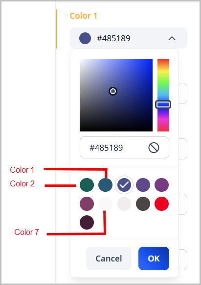
To configure a color palette:
- Click > Admin > Themes.
-
Under Themes, click the theme for which you want to configure a color palette.
-
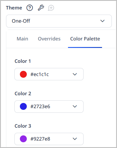
Open the Color Palette tab.
-
Open the color picker for Color 1.
-
Select the color in the color palette by doing one of the following:
- Select the hue and saturation.
- Enter a hex color code.
- Click to remove the color from the color palette.
-
Click OK.
-
Repeat steps 4–6 to select the color palette's remaining colors.
-
Click Save.
The color palette appears in many places around Brightspot. When applying overrides to module colors, for example, the color palette that appears will draw from the values of the color palette that you apply here.
User theme overrides
In a production environment, you apply a theme at the global and site levels. For example, for the global site you can apply one theme, and for the individual sites , you can apply other themes. In a testing environment, you can override a site’s theme at your user level. When you view an asset that is associated with the site, Brightspot applies the overriding theme; for all other visitors, Brightspot applies the site’s theme.
Overriding the theme at the user level changes the theme that the user sees in preview. It does not change anything for site visitors.
Overriding global theme
To override the global theme for the user:
- In the header, click your username, then click Profile.
- From the CMS tab, expand the Advanced cluster.
- From the Global Theme Override field, select the theme you want to use.
- Click Save.
Overriding site theme
To override the site theme for the user:
- In the header, click your username, then click Profile.
- From the CMS tab, expand the Advanced cluster.
- From the Site Theme Override field, select the theme you want to use.
- Click Save.
Changing themes
You can change a site's appearance and behavior using a one-off theme or a shared theme.
One-off themes
You can apply a one-off theme at the global and site levels. Using this technique, you can start with an existing theme and then customize individual components, such as text color or localization. For example, if the only difference between one site and another is the text color, you can leverage an existing theme to create a one-off theme for the second site and then change the text color.
To apply a one-off theme to a site:
- Click > Admin > Sites & Settings.
-
Under Sites, select the site to which you want to apply a theme, or select Global to apply the theme to all sites.
-
Ensure you are on the Main tab.
-
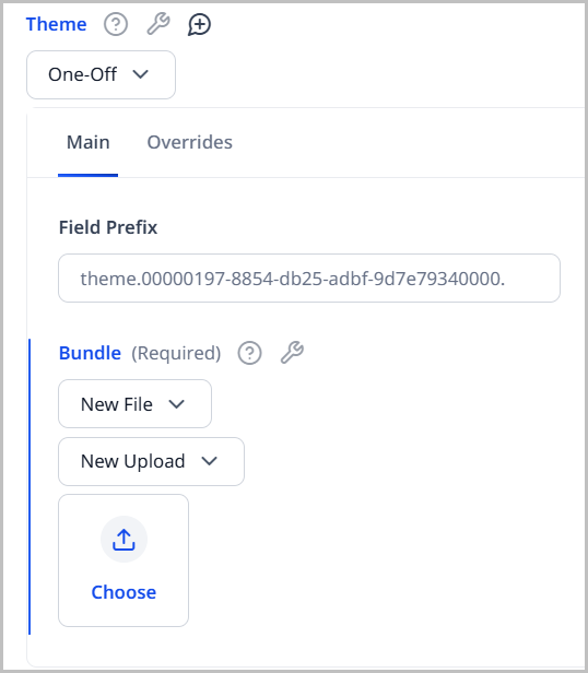
Scroll down to Theme, and select One-Off.
-
Under Main, do the following:
-
In the Field Prefix field, enter a prefix that applies the override to other themes. Other themes with this prefix inherit the settings you make for this theme.
-
Under Bundle, do one of the following:
- Select Existing, and select an existing theme bundle.
- Select New File, and upload a new theme bundle or provide a URL to an existing one.
Your form looks similar to the following:
-
-
Customize the localization by doing the following:
- Under Overrides > Localization > Localization Bundles, click .
- Select a locale, and add localization items. For more information, see Localization.
-
Click Save.
-
Under Color Palette, customize the colors this one-off theme provides. These colors override the colors defined in the theme you selected in step 4b.
-
Click Save.
Shared themes
You can apply a shared theme at the global and site levels. Any asset appearing on the site inherits the theme's settings. For example, if you associate the theme Custom with the site Brightspot, visitors to the site Brightspot see content rendered with the theme Custom.
To apply a shared theme to a site:
- Click > Admin > Sites & Settings.
- Under Sites, select the site to which you want to apply a theme, or select Global to apply the theme to all sites.
- Click , located to the left of , and type
Theme. - Scroll down to Theme, and select Shared.
- From the drop-down list, select the required theme.
- Click Save.
Swapping versions
You can switch between different versions of a theme.
To use a different version of a theme:
- Click > Admin > Themes.
- In the Themes widget, click the theme whose version you want to change.
- From the Bundle list, ensure Existing is selected.
- From the next Bundle list, select a different version.
- Click Save.
All sites using that theme are now using the newly selected version.
Brightspot delivers the selected version as a CSS file that may already be in a browser's cache. If visitors don't see the new version, advise them to clear their browser's cache.
Limiting styles in themes
You can limit the styles available on modules and other components in Brightspot.
To limit styles:
- From the left navigation, under Admin, click Theme.
- In the Themes list, select a theme.
- Under the Overrides tab, click the Allowed Styles field, and select one of the following:
- All—All styles are available. This option is selected by default.
- All Except—All styles are available except the ones you specify.
- None—No styles are available.
- Some—Only those styles you select are available.
- Click Save.
Styleguide
Brightspot's Styleguide editor is an interface that provides a preview of your site's front end and allows you to customize its various styling elements. Though front-end engineers typically launch Styleguide locally, it is also available inside the CMS. This topic explains how to use Styleguide inside the CMS.
To access Styleguide:
- Click > Admin > Themes.
- Under Themes, click the theme for which you want to enter Styleguide.
- Under Main, click Open Styleguide.
Overview
Styleguide tools help developers manage and understand how templates are generated. The following tools are currently available to developers:
- JSON—Displays JSON representation of the template you are viewing.
- Inspect—Reveals the template name, the path used to construct the template, and any associated styles.
- Fields—Allows you to manipulate colors and styles as well as set theme and template presets to save time.
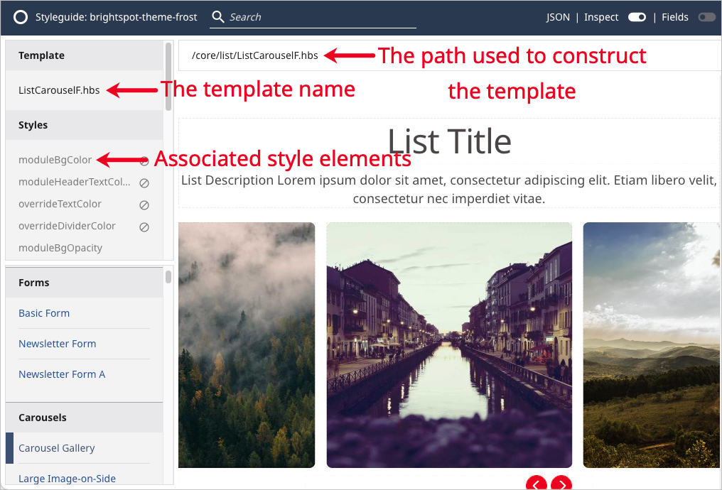
The following graphic shows the inspect function for the Form template.
Viewing template JSON representation
You can use Styleguide to view the JSON representation of a template in a new tab.
To view the JSON representation of a template:
- Open Styleguide. For details, see Styleguide.
- In the left rail, select a template for which you want to view the JSON representation.
- In the upper right corner of the screen, click JSON.
Styleguide outputs the JSON representation for the selected template in a new tab.
Inspecting Styleguide templates
You can inspect a Styleguide template to see its name, a list of associated style elements, and the path used to construct it.
To inspect templates:
- Open Styleguide. For details, see Styleguide.
- In the left rail, select a template that you want to inspect.
- In the upper right corner of the screen, toggle on Inspect.
The following information is now available:
- Under Template, the template name.
- Under Styles, a list of associated style elements.
- At the top of the preview pane, the path used to construct the template.
Showing or hiding template fields
You can show or hide the field sidebar when viewing Styleguide.
To show or hide fields:
- Open Styleguide. For details, see Styleguide.
- In the left rail, select a template whose fields you want to show or hide.
- In the upper right corner of the screen, toggle on Fields.
Customizing a theme using Styleguide
You can use Styleguide to customize a theme. (To customize a theme in the CMS, see Customizing a theme.)
To customize a theme using Styleguide:
- Open Styleguide. For details, see Styleguide.
- In the upper right corner of the screen, toggle on Fields.
- Under the Theme and Template tabs, and using the tables in Customizing a theme as a reference, modify as desired.
- Click to see a preview of your changes. Click to revert back to the default theme settings.
- To save a preset of your modifications for future use, see Creating presets.
- Styling elements with the value No Color have no override and inherit the theme bundle's color.
- To remove a color override and restore the theme's original color, click to open the color picker, click , and then click OK.
Creating presets
You can save your theme and template configuration options as presets, allowing you to apply them to any site using a theme. You can create presets at both the theme and the individual template level. An editor may benefit from a preset in the following scenarios:
- An editor repeatedly sets the same style configurations for specific modules, and therefore sets a preset to save time.
- An administrator wants to cut down on editors relying on custom configurations as often, so the administrator sets a preset that the editor can use.
Theme presets
You can create a theme preset in Styleguide.
To create a theme preset:
-
Open Styleguide. For details, see Styleguide.
-
In the upper right corner of the screen, toggle on Fields.
-
In the Theme tab, configure as necessary.
noteClick to see a preview of your changes. Click to revert back to the default theme settings.
-
Click Create Preset.
-
Under Preset Label, enter a name for the preset.
-
Click Save.
To use the preset in the future, select it from the Style Preset list.
Template presets
You can create a template preset in Styleguide.
To create a template preset:
-
Open Styleguide. For details, see Styleguide.
-
In the left rail, select a template for which you want to create a preset.
-
In the upper right corner of the screen, toggle on Fields.
-
Click Template to open the template tab.
-
In the Template tab, configure as necessary. For details on the available fields, see Customizing a theme.
noteClick to see a preview of your changes. Click to revert back to the default theme settings.
-
Click Create Preset.
-
Under Preset Label, enter a name for the preset.
-
Click Save.
To use this template preset, apply it either to an asset or to an entire theme. For details, see Applying a template preset to an asset or Applying a template preset to a theme.
To edit this template in the future, select it from the Style Preset list.
Updating presets
You can update theme and template presets.
To update a theme or template preset:
- Open Styleguide. For details, see Styleguide.
- In the upper right corner of the screen, toggle on Fields.
- Under Style Preset, select the theme or template preset that you want to update.
- Make changes as necessary.
- Click Update Preset.
Renaming presets
You can rename theme and template presets.
To rename a theme or template preset:
- Open Styleguide. For details, see Styleguide.
- In the upper right corner of the screen, toggle on Fields.
- Under Style Preset, select the theme or template preset that you want to rename.
- Click , then click Rename Preset.
- Under Preset Label, enter a new name for the preset.
- Click Save.
Deleting presets
You can permanently delete theme and template presets.
To permanently delete a theme or template preset:
- Open Styleguide. For details, see Styleguide.
- In the upper right corner of the screen, toggle on Fields.
- Under Style Preset, select the theme or template preset that you want to delete.
- Click , then click Delete Preset.
- In the confirmation prompt, click OK.
Applying presets
To assets
Once you create a template preset, you can apply it to an asset, which overrides the theme the asset inherits from the site in which it appears. For details on how to apply a template preset to a theme, see Applying a template preset to a theme.
To apply a template preset to an asset:
- Ensure that you have created a template preset. For details, see Creating a template preset.
- Search for and open the asset to which you want to apply a template preset. For a list of available assets, see the Content Types Guide.
- Under the Styles tab, in the Preset field, select the template preset.
- Complete your site's workflow and publish the asset.
To themes
Once you create a template preset, you can apply it to an entire theme, which affects all assets that present that theme on your site. For details on how to apply a template preset to a specific asset, see Applying a template preset to an asset.
To apply a template preset to a theme:
- Ensure that you have created a template preset. For details, see Creating a template preset.
- Click > Admin > Themes.
- From the Themes list on the left, select an existing theme.
- Under the Overrides tab, in the Preset field, select the template preset.
- Click Save.
Sharing Styleguide previews
You can share a preview of the theme you build in Styleguide with others.
To share Styleguide previews with others:
- Open Styleguide. For details, see Styleguide.
- At the top of the screen, click Open in New Window/Tab.
- Copy the URL of the new window or tab and share it.
Any users who open the page are able to view Styleguide; however, any edits they make are not saved.