Getting started
Brightspot is a content management system designed to power dynamic consumer experiences that are editorially rich and visually stunning. Brightspot brings teams together and streamlines daily design, development, and editorial processes.
Logging in
Brightspot supports three kinds of authentication in order to log in:
- Generic login requiring only a username and password.
- Two-factor authenticated login requiring a username, password, and a third-party authentication app like Google Authenticator. For details, see Two-factor authentication.
- External authentication using an identity and access management service like OneLogin. For details, see Single sign-on and SAML.
This topic briefly explains how to log into Brightspot using these methods.
To log in to Brightspot with only a username and password:
-
Go to the URL provided by your Brightspot administrator.
-
Enter the username and password provided to you by your administrator.
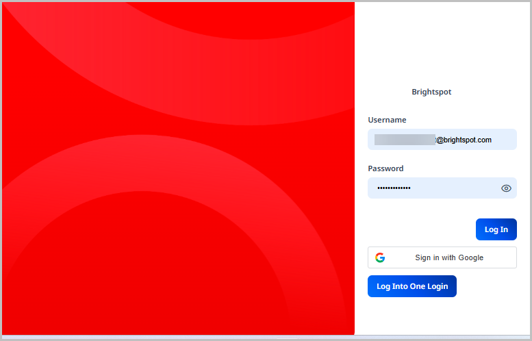
-
Click Log in.
To log in to Brightspot with two-factor authentication enabled:
- Go to the URL provided by your Brightspot administrator.
- Enter the username and password provided to you by your administrator.
- Click Log in.
- Enter the code found in your authentication app.
- Click Submit.
To log in to Brightspot using external authentication:
- Go to the URL provided by your Brightspot administrator.
- Enter the username provided to you by your administrator.
- Click Submit.
If you are already authenticated through the external authenticator, you are logged in to Brightspot. If not, complete the verification steps as directed by the external authenticator.
User interface
Brightspot features an intuitive user interface to make working in the CMS easy and efficient.
When you first log into Brightspot, you are taken to your dashboard. Below is an example of what your dashboard might look like. Keep in mind, dashboards are customizable, and yours may look different.
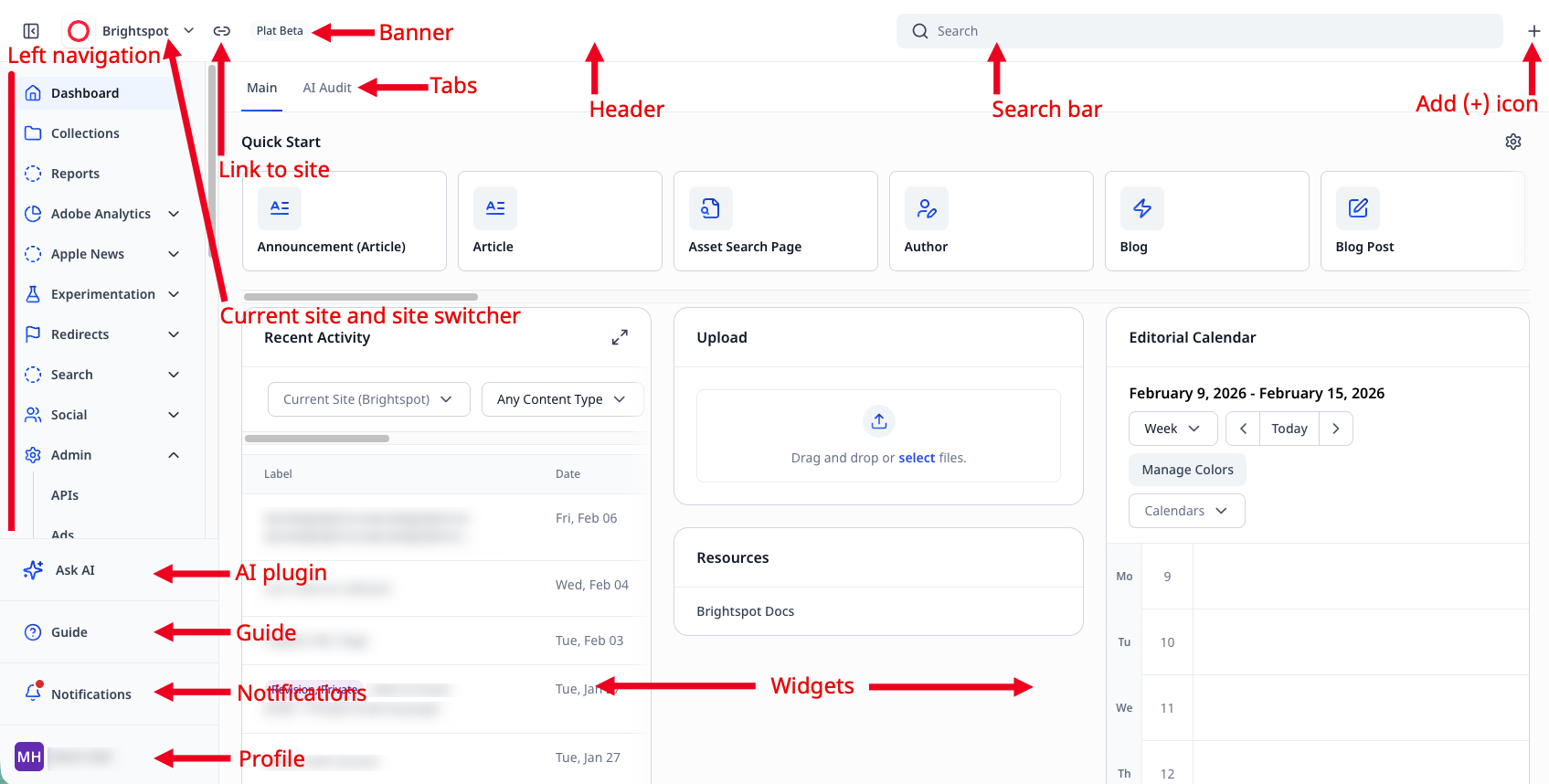
Left navigation
On the left is the left navigation, which allows you to navigate to many different administrative areas of Brightspot. It also includes the following:
- Guide, where you can see descriptions of the fields you are viewing
- Notifications, where you can view your mentions across Brightspot.
- Your profile, where you can personalize Brightspot.
If you have the Ask AI plugin enabled, you can access Ask AI here as well.
Current site and site switcher
The search field allows you to enter text to find assets within Brightspot. There are several filters and options available to you as you search. See Brightspot search for more information.
Link to site
Clicking opens the front end of the site you are in.
Language
The language in which you are viewing Brightspot.
Banner
An optional display of the type of environment you are using (for example, Production or QA).
Search bar
A site-wide search where you can enter text and find assets within Brightspot There are several filters and options available to you as you search. See CMS Search for more information.
Add (+) icon
The add icon provides an easy way to create assets within Brightspot. See Creating content for more information on using this icon.
Dashboard tab
Dashboard tabs allow you to access different facets of your dashboard. These tabs will vary based on your dashboard.
Quick Start widget
The Quick Start widget is a series of buttons that allow you to quickly create assets or access the items you use most within Brightspot.
Dashboard widgets
Dashboard widgets vary by dashboard. Some widgets provide information on assets that have recently been created or updated, while other widgets can provide analytics information.
Profile menu
The Brightspot user menu provides links to several bits of functionality that are specific to your user account. From the user menu you can modify your profile settings, view your history, etc.
To access your user menu, click your username.
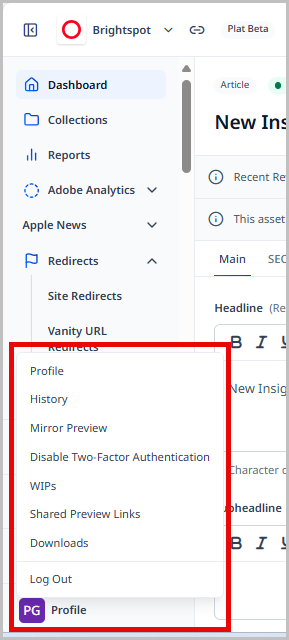
This expands a menu with several items you can modify or use when you are logged into Brightspot.
The user menu has several options available to you that are specific to your Brightspot user account.
Using the above image as a reference, here are the options available to you from the user menu:
- Profile—Opens your user profile where you can set your user options for how Brightspot looks and behaves for you. See Configuring your profile for more information.
- History—Displays a list of the assets or areas within Brightspot that you have most recently visited.
- Mirror Preview—Provides a QR code you can use to preview assets on other devices. See Previewing content on mobile devices for more information.
- Enable Two-Factor Authentication—Provides a QR code where you can set up two-factor authentication for logging into Brightspot.
- WIPs—Displays a list of assets you have made changes to that are not yet saved or published.
- Shared Preview Links—Opens a list of all the shared preview links a user has generated, allowing you to delete them if you no longer want them to be accessible.
- Downloads—Opens a history of your downloads from the CMS.
- Log Out—Logs you out of Brightspot.
User profile
Brightspot offers you several ways to customize your experience by modifying your user settings. This includes avatars, colors, dashboards, etc.
To access your profile:
- In the header, click your username to open the profile menu.
- Click Profile.
Configuring your profile
Your profile is divided into two main tabs: Main and CMS. Each tab has specific settings you can configure. The Main tab focuses on your settings as a user such as username, password, etc. The CMS tab focuses on how Brightspot appears to you when you use it in terms of dashboards, themes, etc.
Depending on your Brightspot implementation, there may be additional tabs specific to your configuration.
To configure your profile:
- In the header, click your username, then click Profile.
- Select either the Main or CMS tab.
- Using the following tables as a reference, configure your profile.
- Click Save.
Main tab
| Field | Description |
|---|---|
| Name | The name associated with items you create. This name appears in various widgets in Brightspot, such as the Recent Activity widget on the dashboard, or the Version History widget on a content edit page. |
| Your email address. | |
| Username | The username you use to log in to Brightspot. |
| Password | The password used for logging in to Brightspot. You have two choices:
|
| Avatar | Your avatar.
|
| Locale | Sets your language and location. Setting the locale has two effects:
|
| Time Zone | Sets your time zone. |
| Phone Number | Your phone number for receiving text messages from Brightspot. |
Notifications
| Field | Description |
|---|---|
| Delivery Methods | Displays the delivery methods you have set up for notifications. Click to add additional methods. |
| Subscriptions | Displays your subscriptions. Click to add additional subscriptions. |
| Automatic Subscriptions | Automatic subscriptions are configured by your administrator. You can specify your default delivery methods for all of them, as well as override or disable on an individual basis. |
Slack
This tab only displays if you have the Slack integration configured. See Slack.
| Field | Description |
|---|---|
| Linked Accounts | Displays any Slack accounts you have linked to your Brightspot account. You can configure Slack as one of your delivery methods for notifications. |
CMS tab
Dashboard
| Field | Description |
|---|---|
| Dashboard | Sets the dashboard you see when you log into Brightspot. This setting has three options:
|
| Edit Existing Content | Allows you to add specific assets to your Quick Start widget for easy access. For instance, perhaps you edit the same page every week. You can set that page so it appears in your Quick Start widget so you do not have to search for it. |
Content Templates
| Field | Description |
|---|---|
| Global Defaults | List of available default templates. If blank, the default templates flow from your role's default templates (if any). |
| Global Extras | List of available extra templates. If blank, the extra templates flow from your role's extra templates (if any). |
| Site Specific Defaults | Overrides the default templates for individual sites. If blank, the site-specific default templates flow from your role's site-specific default templates (if any). |
| Site Specific Extras | Overrides the extra templates for individual sites. If blank, the site-specific extra templates flow from your role's site-specific extra templates (if any). |
UI
| Fields | Description |
|---|---|
| Preset Theme | Select one of the themes to use for Brightspot. If you select Custom, you can configure the following colors for individual UI elements:
|
| Appearance | List of appearances, including:
|
| Enable Boxed Input |
|
| Enable Compact | Displays the content edit form with smaller labels and fields, so more of it appears in your screen without scrolling. |
| Enable Compact Rails | Displays widgets in the right and left rails with smaller labels and fields, so more of them appear in your screen without scrolling. |
| Enable High Contrast | Displays Brightspot in a high-contrast mode, improving accessibility and ideal when working outside or with strong ambient light. |
| Header Background | Background color of header. |
| Enable Post Publish Actions | If toggled on, Brightspot provides suggestions for positioning assets after they are published. For more information, see Post-publishing actions. |
| Open Post Publish Actions Automatically | If toggled on, Brightspot displays the widget for post-publish positioning after the asset is first published. If toggled off, you can still access post-publish positioning by clicking > Post Publish Actions. For more information, see Post-publishing actions. |
Advanced
| Field | Description |
|---|---|
| Inline Editing | Items you can edit using the inline editor.
|
| Return to Dashboard on Save | If marked, you automatically return to the dashboard after saving changes to an item. |
| Return to Dashboard on Workflow | If marked, you automatically return to the dashboard after adding an item to a workflow. |
| Disable Navigate Away Alert | If marked, you do not receive a message when leaving the content edit page without saving or publishing. The following illustration is an example of a navigate-away alert.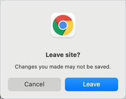 |
| Disable Work In Progress | Disables the work-in-progress feature. When toggled on, this feature maintains live backups of work if your Brightspot session unexpectedly ends. |
| Global Theme Override | Displays previews using the selected theme. |
| Site Theme Overrides | Displays previews using the selected theme for the selected site. |
Assignment Desk tab
This tab is only visible if the Assignment Desk plugin has been enabled.
| Field | Description |
|---|---|
| Team Member Role | Expand and select your role. If your role isn't available you can click Create New to add your role. |
| Contact Information | Click Set to display the contact information fields:
|
| Notes | Enter any special information pertaining to your Assignment Desk profile. |