Form modules
A form is a module that enables visitors to submit data to your website. You can use forms to collect contact information from a visitor, prompt a visitor to provide additional information about special interests, and generally increase engagement with your website.
Once a form is created, you can slot it into assets and landing pages to display in conjunction with other content. This can be done at the asset level or at the site level. For details, see Layout structure.
This section explains how to create various types of forms.
For a wire frame example of what this content type can look like on your site, see Form module design.
Creating forms
You can create a few different types of forms.
Contact forms
A contact form is a common vehicle for enabling visitors to leave contact information, often for a sales, consultant, or technical support representative to initiate further discussion with the visitor.
To create a contact form:
- In the header, click .
- From the Create list, select Contact Form Module.
- Using the following table as a reference, complete the fields as needed.
- Complete your site's workflow and publish the contact form.
- Main
- Overrides
- Submissions
- Styles
| Field | Description |
|---|---|
| Internal Name | Enter an internal name for this asset. Brightspot uses this name internally, such as in the search panel and recent activity widget. This name is not visible to visitors to your site. |
| Title | Enter a title for this asset. This title is visible to the visitors to your site. |
| Description | Enter a description that describes this asset. This description is visible to the visitors to your site. |
| Items | Click , and select types of form fields. (Forms typically contain more than one field.) For details about configuring each form field, see Types of form fields. |
| Actions | Click , and select actions that occur when the visitor submits the form. For details about configuring submission actions, see Form submission actions. |
| Success Message | Enter the message that a visitor sees when successfully submitting the form. |
| Error Message | Enter the message that a visitor sees when an error occurs after submitting the form. |
| Field | Description |
|---|---|
| Anchor | Modify the anchor to something that would make sense when appearing in an Anchor field's drop-down menu on another asset. This allows you to directly link to this module in another asset. Being specific makes it easier to identify in a list of other anchors. |
| Field | Description |
|---|---|
| Submissions | Displays all of the "submissions" for this contact form. It shows data for each submission. This data can be exported. |
Form Styles
| Field | Description |
|---|---|
| Preset | Select one of the following: - None—Applies styling from the site's theme. - Custom—Opens a form to customize the site's theme for this asset. - (Various)—Aside from None or Custom, there may be additional options in this list depending on the value selected in the Template field. If the selected template has presets, then those presets are able to be selected in this list and applied. For information about configuring template presets, see Creating a template preset. |
| Choose a Background Color | Enter the hexadecimal value of a background color for this module. For instance, entering #000888 provides a dark blue background. |
| Choose a Background Image | Set a background image for this module. |
| Change Primary Text Color to Primary Inverse Text Color (Set in Theme Colors) | Toggle on to convert the primary color of the text in the module to the inverse color of the text set in the theme. |
| Choose the Position of the Module Header | Overrides the default position of the module header as specified in your theme's CSS file. |
| Module Title Size | Overrides the default text size of the module title as specified in your theme's CSS file. |
| Module Description Size | Overrides the default text size of the module description as specified in your theme's CSS file. |
You can design a custom form using a variety of fields and messages.
Custom forms
To create a custom form:
- In the header, click .
- From the Create list, select Custom Form Module.
- Using the following table as a reference, complete the fields as needed.
- Complete your site's workflow and publish the custom form.
- Main
- Overrides
- Styles
| Field | Description |
|---|---|
| Internal Name | Enter an internal name for this asset. Brightspot uses this name internally, such as in the search panel and recent activity widget. This name is not visible to visitors to your site. |
| Title | Enter a title for this asset. This title is visible to the visitors to your site. |
| Description | Enter a description that describes this asset. This description is visible to the visitors to your site. |
| Items | Click , and select types of form fields. (Forms typically contain more than one field.) For details about configuring each form field, see Types of form fields. |
| Actions | Click , and select actions that occur when the visitor submits the form. For details about configuring submission actions, see Form submission actions. |
| Success Message | Enter the message that a visitor sees when successfully submitting the form. |
| Error Message | Enter the message that a visitor sees when an error occurs after submitting the form. |
| Field | Description |
|---|---|
| Anchor | Modify the anchor to something that would make sense when appearing in an Anchor field's drop-down menu on another asset. This allows you to directly link to this module in another asset. Being specific makes it easier to identify in a list of other anchors. |
Form Styles
| Field | Description |
|---|---|
| Preset | Select one of the following: - None—Applies styling from the site's theme. - Custom—Opens a form to customize the site's theme for this asset. - (Various)—Aside from None or Custom, there may be additional options in this list depending on the value selected in the Template field. If the selected template has presets, then those presets are able to be selected in this list and applied. For information about configuring template presets, see Creating a template preset. |
| Choose a Background Color | Enter the hexadecimal value of a background color for this module. For instance, entering #000888 provides a dark blue background. |
| Choose a Background Image | Set a background image for this module. |
| Change Primary Text Color to Primary Inverse Text Color (Set in Theme Colors) | Toggle on to convert the primary color of the text in the module to the inverse color of the text set in the theme. |
| Choose the Position of the Module Header | Overrides the default position of the module header as specified in your theme's CSS file. |
| Module Title Size | Overrides the default text size of the module title as specified in your theme's CSS file. |
| Module Description Size | Overrides the default text size of the module description as specified in your theme's CSS file. |
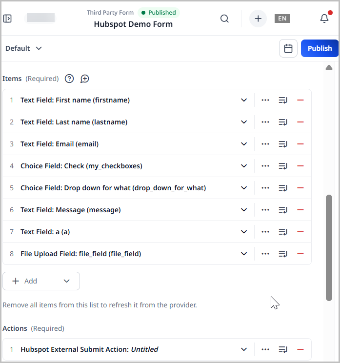
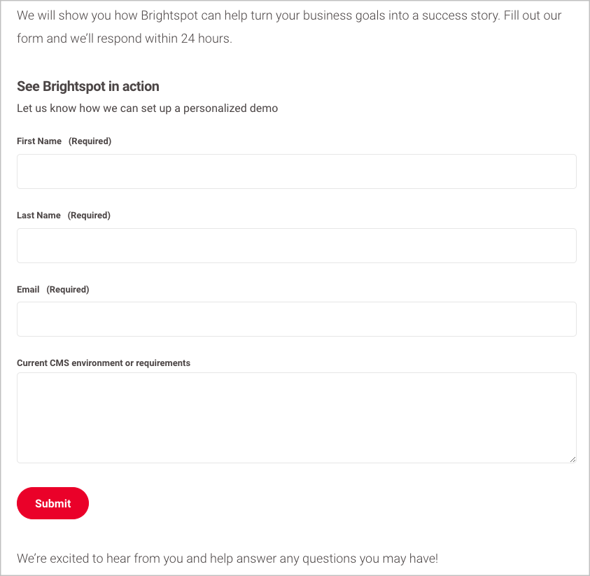
Third-party forms
You can design a third-party form using a variety of fields and messages. For details on which third-party form providers are available, see Integrations.
To create a custom form:
- In the header, click .
- From the Create list, select Third-Party Form Module.
- Using the following table as a reference, complete the fields as needed.
- Complete your site's workflow and publish the custom form.
- Main
- Overrides
- Styles
| Field | Description |
|---|---|
| Provider | Select a provider from the list: - Hubspot—Under Hubspot Form, associate this third-party form with an imported Hubspot form. - Mailchimp—Under Audience, associate this third-party form with an existing audience. For details, see Creating audiences. - Marketo—Under Marketo Form, associate this third-party form with an imported Marketo form. For details, see Configuring Marketo. - Pardot—Under Pardot Form, associate this third-party form with an imported Pardot form. Under Form Handler Code, enter your Pardot account's form handler code. |
| Internal Name | Enter an internal name for this asset. Brightspot uses this name internally, such as in the search panel and recent activity widget. This name is not visible to visitors to your site. |
| Title | Enter a title for this asset. This title is visible to the visitors to your site. |
| Description | Enter a description that describes this asset. This description is visible to the visitors to your site. |
| Items | Click , and select types of form fields. (Forms typically contain more than one field.) For details about configuring each form field, see Types of form fields. |
| Actions | Click , and select actions that occur when the visitor submits the form. For details about configuring submission actions, see Form submission actions. |
| Success Message | Enter the message that a visitor sees when successfully submitting the form. |
| Error Message | Enter the message that a visitor sees when an error occurs after submitting the form. |
| Field | Description |
|---|---|
| Anchor | Modify the anchor to something that would make sense when appearing in an Anchor field's drop-down menu on another asset. This allows you to directly link to this module in another asset. Being specific makes it easier to identify in a list of other anchors. |
Form Styles
| Field | Description |
|---|---|
| Preset | Select one of the following: - None—Applies styling from the site's theme. - Custom—Opens a form to customize the site's theme for this asset. - (Various)—Aside from None or Custom, there may be additional options in this list depending on the value selected in the Template field. If the selected template has presets, then those presets are able to be selected in this list and applied. For information about configuring template presets, see Creating a template preset. |
| Choose a Background Color | Enter the hexadecimal value of a background color for this module. For instance, entering #000888 provides a dark blue background. |
| Choose a Background Image | Set a background image for this module. |
| Change Primary Text Color to Primary Inverse Text Color (Set in Theme Colors) | Toggle on to convert the primary color of the text in the module to the inverse color of the text set in the theme. |
| Choose the Position of the Module Header | Overrides the default position of the module header as specified in your theme's CSS file. |
| Module Title Size | Overrides the default text size of the module title as specified in your theme's CSS file. |
| Module Description Size | Overrides the default text size of the module description as specified in your theme's CSS file. |
Incorporating third-party forms
The following procedure describes how to incorporate a third-party form into your assets.
To incorporate a third-party form in an asset:
- Create or open the asset in which you want to incorporate the form.
- Expand Overrides > Layout Overrides and scroll to the Above, Aside, and Below lists for the module’s position. For an illustration of these positions, see Layout structure.
- From one of the Above, Aside, or Below drop-down lists, select Replace. For an explanation of the possible selections for module placement, see Layout structure.
- Click Add Module, and in the module picker, select Misc > Form Module.
- Back on the content edit form, from the Form list, select the required form.
- Complete your site's workflow and publish the asset.
Embedding forms
You can embed forms directly into your assets using the rich-text editor.
To embed a form:
- From the rich-text editor's toolbar, select > Form.
- Select an existing form.
- Click Save & Close.
Types of form fields
The following sections describe the different types of fields available in forms. You select and fill out these fields from the Items field when creating or updating a contact form, custom form, or third-party form.
Captcha field
Captcha fields validate whether the visitor filling out the form is human. Brightspot only displays captcha fields if you have configured captcha in Sites & Settings. For details, see Configuring Google ReCAPTCHA. For additional details on adding captcha to forms, including Invisible Captcha, see Adding Google reCAPTCHA to forms.
To add a captcha field:
- Search for and open an existing form asset (contact form, custom form, or third-party form), or create a new one.
- Under Items, click and select Captcha Field.
- Under Label, give the choice field a label.
- Under Description, give the choice field a description.
If this captcha field is meant to be invisible captcha, navigate to the Styles tab, expand the Captcha Input Styles cluster, and toggle on Invisible Captcha.
Choice field
Choice fields allow visitors to select from choices that you configure.
To add a choice field:
-
Search for and open an existing form asset (contact form, custom form, or third-party form), or create a new one.
-
Under Items, click and select Choice Field.
-
Under Label, give the choice field a label.
-
Under Description, give the choice field a description.
-
Under Type, select how the choice will be displayed to the user. The following options are:
-
Dropdown—The user selects choices from a dropdown.
- Allow Multiple—Toggle on to allow multiple selections from the dropdown.
- Placeholder—Enter text that will appear inside the dropdown before being clicked.
- Required—Toggle on if the selection(s) made in this dropdown are required.
-
Checkboxes—The user selects choices by clicking checkboxes.
-
Radio Buttons—The user selects choices by clicking radio buttons.
-
-
Under Choices, click Add Choice, and then give the choice a name by entering a value in the Label field.
-
(Optional) Under the Advanced tab, in the Parameter field, enter a value for the input parameter attribute of this field's input tag (for example,
<input type="text" paramater="my-input-name" />). A developer can use this setting to ingest form data, or it can be used to populate emails with the information a visitor submitted.
Dynamic hidden field
Dynamic Hidden fields allow you to use web properties to discover additional insights about the users who fill out the form.
To add a Dynamic Hidden field:
-
Search for and open an existing form asset (contact form, custom form, or third-party form), or create a new one.
-
Under Items, click and select Dynamic Hidden Field.
-
Under Name, enter a name for the dynamic hidden field. This name is not displayed to the user who fills out the form.
-
Under Dynamic Source, select the desired web property that you want to track:
- Document.Referrer—Captures the page from which a visitor came before landing on your form page. For details, refer to web property documentation.
- HTTP Cookie—Captures data stored in the visitor's browser cookie. Under Cookie Name, specify the cookie.
- Query Parameter—Captures information that is passed into the page via the URL. Under Parameter Name, specify the parameter.
File upload field
File Upload fields allow the visitor to upload files as part of their form submission.
To add a File Upload field:
- Search for and open an existing form asset (contact form, custom form, or third-party form), or create a new one.
- Under Items, click and select Dynamic Hidden Field.
- Under Label, give the file upload field a label.
- Under Description, give the file upload field a description.
- Under Allowed File Types, click , and then select the file types the visitor should be allowed to upload (Image, Video, Audio).
- Toggle on Allow Multiple to allow multiple file uploads.
- Toggle on Required to make this field required.
- (Optional) Under the Advanced tab, in the Parameter field, enter a value for the input parameter attribute of this field's input tag (for example,
<input type="text" paramater="my-input-name" />). A developer can use this setting to ingest form data, or it can be used to populate emails with the information a visitor submitted.
Group field
Group fields allow you to group together other form fields.
To add a Group field:
- Search for and open an existing form asset (contact form, custom form, or third-party form), or create a new one.
- Under Items, click and select Group.
- Under Title, give the group a label.
- Under Description, give the group a description.
- Under Items, add a form field. Refer to the documentation on this page for additional details about form field types.
Hidden field
Hidden fields allow you to capture additional data points when the visitor submits the form.
To add a Hidden field:
- Search for and open an existing form asset (contact form, custom form, or third-party form), or create a new one.
- Under Items, click and select Hidden Field.
- Under Name, enter the name of the value that you want to be submitted when the form is submitted.
- Under Value, enter the value that you want to be submitted when the form is submitted.
- (Optional) Under the Advanced tab, in the Parameter field, enter a value for the input parameter attribute of this field's input tag (for example,
<input type="text" paramater="my-input-name" />). A developer can use this setting to ingest form data, or it can be used to populate emails with the information a visitor submitted.
Story subheadline template field
To add a story subheadline templtate field:
-
Search for and open an existing form asset (contact form, custom form, or third-party form), or create a new one.
-
Under Items, click and select Story Subheadline Template Field.
-
Under Label, give the field a label.
-
Under Description, give the field a description.
-
Under Type, select one of the following:
- Short Text—Adds a simple text field to the form into which a visitor may type.
- Email—Adds a text field to the form into which a visitor may type an email address.
- Long Text—Adds a large field into the form into which a visitor may type.
- Phone Number—Adds a text field to the form into which a visitor may type a phone number.
-
Under Placeholder, enter text that will appear inside the field before being selected.
-
Toggle on Required to make this a required field.
-
(Optional) Under the Advanced tab, in the Parameter field, enter a value for the input parameter attribute of this field's input tag (for example,
<input type="text" paramater="my-input-name" />). A developer can use this setting to ingest form data, or it can be used to populate emails with the information a visitor submitted.
Text field
Text fields are standard fields where a visitor enters data to submit as part of the form.
To add a Text field:
-
Search for and open an existing form asset (contact form, custom form, or third-party form), or create a new one.
-
Under Items, click and select Text Field.
-
Under Label, give the text field a label.
-
Under Description, give the text field a description.
-
Under Type, select one of the following:
- Short Text—Adds a simple text field to the form into which a visitor may type.
- Email—Adds a text field to the form into which a visitor may type an email address.
- Long Text—Adds a large text field into the form into which a visitor may type.
- Phone Number—Adds a text field to the form into which a visitor may type a phone number.
-
Under Placeholder, enter text that will appear inside the text field before being selected.
-
Toggle on Required to make this a required field.
-
(Optional) Under the Advanced tab, in the Parameter field, enter a value for the input parameter attribute of this field's input tag (for example,
<input type="text" paramater="my-input-name" />). A developer can use this setting to ingest form data, or it can be used to populate emails with the information a visitor submitted.
Form submission actions
When a visitor fills out a contact form, custom form, or third-party form, and clicks Submit, Brightspot ingests the data and can take a variety of actions with it.
Data Collection Action
Brightspot stores the submitted data in a raw format, and your web application can ingest the data as required.
Email Action
Brightspot sends an email after ingesting the data. You can configure the email to include information that the visitor submitted in the contact form using a command of the form ${parameter-name}. The following example shows how to send an email to a customer service center that includes the visitor's email address.
Step 1: Set parameter value
Create a form with an email text field. Under > Advanced, in the Parameter field, note or change the value as required.
Step 2: Refer to parameter
Create an email action that uses the parameters.
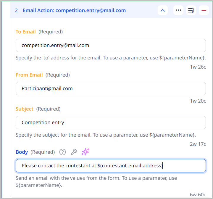
In the previous illustration, Brightspot populates the email's body using the value visitors-email-address that the visitor entered using the form in Step 1.
Step 3: Add filtering rules
You can add filtering rules that examine email addresses before Brightspot forwards them to your email server. Brightspot processes only those email addresses that match the rule.
-
Under > Styles, in the Custom Pattern field, enter a regular expression.
-
In the Custom Pattern Message field, enter a message that appears on the form should the submitted email address not conform to the regular expression.
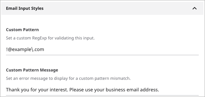
Referring to the previous image, if the submitted email address contains @example.com, Brightspot displays the following message:
Thank you for your interest. Please use your business email address.
External Submit Action
Brightspot can forward a visitor's contact information to an external application. This scenario occurs when your organization manages a sales or technical support effort using an application other than Brightspot.
To configure an external form submission action:
- Under Actions, click External Submit Action. An Action Link form appears.
- Using the following table as a reference, configure the external link and the information sent to it.
| Field | Description |
|---|---|
| Submit Method | GET or POST. For an explanation of these terms, see The Method Attribute. Consult with the external application's developers to determine which of these settings to use. |
| Main widget | |
| URL | URL of the application that ingests the visitor's data. |
| Advanced widget | |
| Target | How the visitor's browser displays the response from the external application. - Same Window/Tab—Browser displays the external application's response in the same browser window or tab from where the visitor submitted the form. This selection replaces your form with the response. - New Window/Tab—Browser displays the external application's response in a new browser window or tab. |
| Attributes | Name and value pairs Brightspot appends to the visitor's submitted contact information. You can use this field to collect additional information about the visitor, such as from which site the visitor submitted the form. |
Third-Party Submit Action (Hubspot, Marketo)
When you select an third-party external submit action, such as Hubspot External Submit Action or Marketo External Submit Action, Brightspot can forward a visitor's contact information to an external application. This scenario occurs when your organization manages a sales or technical support effort using an application other than Brightspot.
To configure an external form submission action:
- Under Actions, click External Submit Action. An Action Link form appears.
- Using the following table as a reference, configure the external link and the information sent to it.
| Field | Description |
|---|---|
| Submit Method | GET or POST. For an explanation of these terms, see The Method Attribute. Consult with the external application's developers to determine which of these settings to use. |
| Pre Processor | The action Brightspot takes before forwarding the form submission. - None—No action is taken, and Brightspot forwards the form submission directly to the URL. - Default External Submission Pre Processor—Brightspot pre-processes the form submission, inspecting it for malicious or invalid data before forwarding the submission to the URL. This option is ideal for relieving high-volume receiving servers that may not have enough resources to do the inspection. |
| Main widget | |
| URL | URL of the application that ingests the visitor's data. |
| Advanced widget | |
| Target | How the visitor's browser displays the response from the external application. - Same Window/Tab—Browser displays the external application's response in the same browser window or tab from where the visitor submitted the form. This selection replaces your form with the response. - New Window/Tab—Browser displays the external application's response in a new browser window or tab. |
| Attributes | Name and value pairs Brightspot appends to the visitor's submitted contact information. You can use this field to collect additional information about the visitor, such as from which site the visitor submitted the form. |
Viewing form submissions
You can review the information that visitors submit through forms. For custom forms and contact forms you create in Brightspot, the submitted information is available almost immediately. For third-party forms you embed inside an asset, the submitted information may be delayed depending on how your version of Brightspot is configured.
To view a form's submissions:
-
Search for and open the form.
-
Under the Submissions tab, review the submissions.
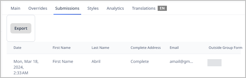
-
Click Export to download the submissions as a .csv file.
See also: