Promo modules
A promo promotes an asset and appears in a containing page. Promo modules can be used as leads for articles, sections, tags, homepages, and more.
For a wire frame example of what this content type can look like on your site, see Promo module design.
Relationship between promos and assets
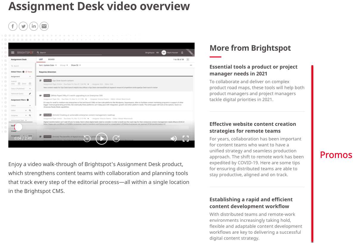
As editors publish assets, they often want to promote those assets within other assets. For example, it is common for an article to have a list of related articles. Those related articles are promos (promotions).
When you create an asset, Brightspot automatically prepares the text for the asset's promo with the following logic:
- Promo title taken from asset's title.
- Promo description taken from first paragraph in asset's body text.
- Promo image taken from asset's lead image or video.
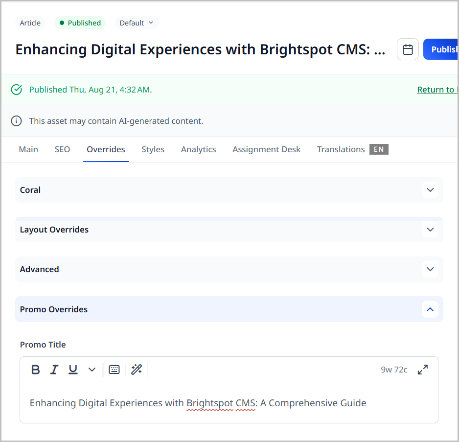
You can view the prepared text under Page Promo Overrides in the content edit form's Overrides tab.
When you add an asset in a list, container, or other module, you are creating a promo. The promo contains the associated title, description, and image. The promo also includes a link to the actual asset.
You may find that a promo's default description or image does not match the context in which they are used. For example, in the previous illustration, the description does not add much to the headline. You can change the title, description, or image to create a better "teaser" that encourages the visitor to click on the promo's link.
Overriding an asset's promo info
Brightspot generates an asset's default promo content from the fields such as headline, subheadline, and lead image. In some scenarios, the default promo content may not be attractive enough to catch a visitor's attention. This section describes how to customize a promo's content so that it is different from the default promo content that Brightspot automatically creates.
To override an asset's promo info:
-
Search for and open the asset whose promo you want to customize.
-
Expand Overrides > Page Promo Overrides.
-
Using the following table as a reference, complete the fields as needed.
-
Complete your site's workflow and publish the asset.
When you add the asset to a list, container, or other module, you are creating a customized promo. The customized promo contains the associated title, description, and image. The promo also includes a link to the actual asset.
| Field | Description |
|---|---|
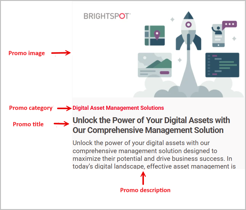
| Promo Title | This field defaults first to the internal asset's Promo Title (if available), and next to the asset's Title or Headline field. This title appears in the shared promo. You can modify the Title if necessary. |
| Promo Description | This field defaults first to the internal asset's Promo Description (if available), and next to the asset's Description field. You can modify the Description if necessary. |
| Promo Image | This field defaults to the internal asset's Lead image (if any). This image appears in the shared promo. You can select a different image if necessary. |
| Promo Category | This field defaults to the internal asset's Section. This category appears in the page promo. You can modify the Promo Category if necessary. |
| Promo Category Link | Configure a link associated with the Promo Category. Select one of the following:
|
The following illustration shows just one example of how Brightspot renders a customized promo.
Creating promos
Brightspot offers a few different types of promos out of the box. Read this section to learn about how to create these different types of promos.
Promos
To create a promo:
- In the header, click .
- From the Create list, select Promo module.
- Using the following table as a reference, complete the fields as needed.
- Complete your site's workflow and publish the page promo.
- Main
- Overrides
- Styles
| Field | Description |
|---|---|
| Internal Name | Enter an internal name for this asset. Brightspot uses this name internally, such as in the search panel and recent activity widget. This name is not visible to visitors to your site. |
| Item | Select one of the following:
|
| Title | This field defaults first to the internal asset's Promo Title (if available), and next to the asset's Title or Headline field. This title appears in the shared promo. You can modify the Title if necessary. |
| Description | This field defaults first to the internal asset's Promo Description (if available), and next to the asset's Description field. You can modify the Description if necessary. |
| Image Override | This field defaults to the internal asset's Lead image (if any). This image appears in the shared promo. You can select a different image if necessary. |
| Call To Action Button Text | Enter text appearing on the call-to-action button. This text is visible to the visitors to your site. |
| Field | Description |
|---|---|
| Category | Enter text to override what appears as the eyebrow text when this promo appears on a page. |
| Anchor | Modify the anchor to something that would make sense when appearing in an Anchor field's drop-down menu on another asset. This allows you to directly link to this module in another asset. Being specific makes it easier to identify in a list of other anchors. |
Advanced
| Field | Description |
|---|---|
| Hide Description | Toggle on to hide the description of the asset contained in the list module. For example, toggling on this setting displays the Headline of an article, but hides the Description of an article contained in the list module. |
| Hide Image | Toggle on to hide the image included on the asset contained in the module. |
| Hide Publish Date | Toggle on to hide the publish date of the assets included in the module. |
| Hide Category | Toggle on to hide the category of the asset included in the module. |
| Hide Author | Toggle on to hide the author of the asset included in the module. |
Page Promo Module Styles
| Field | Description |
|---|---|
| Template | Select the template of this module from the list of options. Templates are visual presentation presets that differ depending on the type of module. |
| Preset | Select one of the following:
|
| Promo Title Size | Overrides the default text size of the promo title as specified in your theme's CSS file. |
| Promo Description Size | Overrides the default text size of the promo description as specified in your theme's CSS file. |
Promo embeds
You can embed an asset's promo into the rich-text editor. The promo contains the title, description, and image from the corresponding asset's promo; you can customize those three elements inside the promo module.
To embed a promo:
- From the rich-text editor's toolbar, select > Promo.
- Using the following table as a reference, complete the fields as needed.
- Click Save & Close.
| Field | Description |
|---|---|
| Promo | Select Inline or Shared. See Inline vs. shared enhancements. |
| Item | Retain Internal, then search for and select the person to promote. Under Target, select whether you want the link to open in the same tab or a new tab. |
| Anchor | Select an anchor, which will route site visitors to a specific area within the promoted asset. |
| Target | Select whether you want the link to open in the same tab or a new tab. |
| Title | Enter a title. |
| Description | Describe the list. |
| Image Override | Select an image to override the default image of the promoted asset. |
| Call To Action Button Text | Enter text to appear on the call-to-action button. |
Page Promo Enhancement Styles
| Field | Description |
|---|---|
| Template | Select one of the available templates for laying out this enhancement. |
| Preset | Select a style preset for this enhancement. |
| Choose Enhancement Alignment | Select an alignment for this list. |
| Promo Title Size | Select the promo title size. |
| Promo Description Size | Select the promo description size. |
| Text Alignment | Select an alignment for the text of this product promo. |
| Choose a Background Color | Select a color for the background of the product promo. |
| Use Text Colors | Select the color to use for text.
|
| Module Padding Top | Select one of the options (None, Small, Medium, Large). |
| Module Padding Bottom | Select one of the options (None, Small, Medium, Large). |
Dynamic promos
A shared dynamic promo can appear in multiple pages. The promo can change over time depending on the sort and filtering criteria you configure.
Dynamic promos display a single promo. If you want to dynamically display more than one promo in a module, use a dynamic list. For details, see List module.
To create a shared dynamic promo:
- In the header, click .
- From the Create list, select Dynamic Promo Module.
- Using the following table as a reference, complete the fields as needed.
- Complete your site's workflow and publish the dynamic promo.
- Main
- Overrides
- Styles
| Field | Description |
|---|---|
| Internal Name | Enter an internal name for this asset. Brightspot uses this name internally, such as in the search panel and recent activity widget. This name is not visible to visitors to your site. |
| Types | Select the content types included in this module. |
| Filtering | Select filtering criteria for this module. For information about the various filters, see Understanding dynamic list filters. |
| Sort | Select the sort order for this module. |
| Field | Description |
|---|---|
| Anchor | Modify the anchor to something that would make sense when appearing in an Anchor field's drop-down menu on another asset. This allows you to directly link to this module in another asset. Being specific makes it easier to identify in a list of other anchors. |
Advanced
| Field | Description |
|---|---|
| Disable Dynamic De-Duplication | Toggle on to allow duplicate promos to appear on the page. Leaving this setting toggled off prevents duplicate promos from appearing on the same page. |
| Locales | Select All Locales, Current Locale, or Some Locales to determine the locale in which the module is displayed. This serves as an exclusion filter to prevent items in different locales from inappropriately populating the module. |
| Hide Description | Toggle on to hide the description of the asset contained in the list module. For example, toggling on this setting displays the Headline of an article, but hides the Description of an article contained in the list module. |
| Hide Image | Toggle on to hide the image included on the asset contained in the module. |
| Hide Publish Date | Toggle on to hide the publish date of the assets included in the module. |
| Hide Category | Toggle on to hide the category of the asset included in the module. |
| Hide Author | Toggle on to hide the author of the asset included in the module. |
Page Promo Module Styles
| Field | Description |
|---|---|
| Template | Select the template of this module from the list of options. Templates are visual presentation presets that differ depending on the type of module. |
| Preset | Select one of the following:
|
| Promo Title Size | Overrides the default text size of the promo title as specified in your theme's CSS file. |
| Promo Description Size | Overrides the default text size of the promo description as specified in your theme's CSS file. |
By default, Brightspot ensures the items in a dynamic promo appear nowhere else on the same rendered page. If you want to allow items in a dynamic promo to duplicate other promos on a rendered page, toggle on Advanced > Disable Dynamic De-Duplication.
Person promo
Editors use Brightspot's Person content type to provide basic information about significant people. Examples of persons include company employees, journalists, academics, and government officials.
The Person content type has its own promo, extracted from the person itself. For example, if you create a person asset for your company's product manager, you can create a promo for that person. You can encourage visitors to read and contact the person with media or sales inquiries.
To create a person promo:
- In the header, click .
- From the Create list, select Person Promo.
- Using the following table as a reference, complete the fields as needed.
- Complete your site's workflow and publish the person promo.
- Main
- Overrides
- Styles
| Field | Description |
|---|---|
| Internal Name | Enter an internal name for this asset. Brightspot uses this name internally, such as in the search panel and recent activity widget. This name is not visible to visitors to your site. |
| Item | Select Internal, indicating the promo links to a person in Brightspot. |
| Item | Select a person. |
| Target | Select how a visitor views the person:
|
| Name | This field defaults to the person's Name. This name is visible to visitors to your site. You can modify the Name if necessary. |
| Description | This field defaults first to the person's Short Biography (if available), and next to the person's Full Biography. This description is visible to visitors to your site. You can modify the Description if necessary. |
| Job Title | This field defaults to the person's Title (if available). This job title is visible to visitors to your site. You can modify the Job Title if necessary. |
| Image | This field defaults to the person's Image (if any). This image is visible to visitors to your site. You can select a different image if necessary. |
| Publication | Not used. |
| Call To Action Button Text | Enter text appearing on the call-to-action button. This text is visible to the visitors to your site. |
| Field | Description |
|---|---|
| Anchor | Modify the anchor to something that would make sense when appearing in an Anchor field's drop-down menu on another asset. This allows you to directly link to this module in another asset. Being specific makes it easier to identify in a list of other anchors. |
Advanced
| Field | Description |
|---|---|
| Hide Biography | Toggle on to hide the Short Biography information for the individual included on the list. |
| Hide Job Title | Toggle on to suppress the display of the job title of the individual included in the list module. |
| Hide Image | Toggle on to hide the image included on the asset contained in the module. |
Person Promo Module Styles
| Field | Description |
|---|---|
| Template | Select the template of this module from the list of options. Templates are visual presentation presets that differ depending on the type of module. |
| Preset | Select one of the following:
|
| Promo Title Size | Overrides the default text size of the promo title as specified in your theme's CSS file. |
| Promo Description Size | Overrides the default text size of the promo description as specified in your theme's CSS file. |
| Choose a Background Color | Enter the hexadecimal value of a background color for this module. For instance, entering #000888 provides a dark blue background. |
| Change Primary Text Color to Primary Inverse Text Color (Set in Theme Colors) | Toggle on to convert the primary color of the text in the module to the inverse color of the text set in the theme. |
| Animate this module on scroll | Toggle on to provide a small animation to this module when it is scrolled into view. |
| Item Image Aspect Ratio | Overrides the default size and shape of the image next to the items in the asset as specified in your theme's CSS file. |
Person promo embeds
You can embed a person's promo into the rich-text editor.
To embed a person promo:
- From the rich-text editor's toolbar, select > Person Promo.
- Using the following table as a reference, complete the fields as needed.
- Click Save & Close.
| Field | Description |
|---|---|
| Promo | Select Inline or Shared. See Inline vs. shared enhancements. |
| Item | Retain Internal, then search for and select the person to promote. Under Target, select whether you want the link to open in the same tab or a new tab. |
| Name | Override the person's name. Leave blank to keep the source person's name. |
| Short Bio | Override the person's abbreviated biography. Leave blank to keep the source person's abbreviated biography. |
| Job Title | Override the person's job title. Leave blank to keep the source person's job title. |
| Image | Search for and select an image to override the person's associated image. Leave blank to keep the source person's associated image. |
| Call To Action Button Text | Enter text to appear on the call-to-action button. |
Person Promo Enhancement Styles
| Field | Description |
|---|---|
| Template | Select one of the available templates for laying out this enhancement. |
| Preset | Select a style preset for this enhancement. |
| Choose Enhancement Alignment | Select an alignment for this list. |
| Promo Title Size | Select the size of the promo title. |
| Promo Description Size | Select the size of the promo description. |
| Choose a Background Color | Select a color for the background of the person list. |
| Use Text Colors | Select the color to use for text.
|
| Image Aspect Ratio | Select an aspect ratio for the items in this list. |
Product Promo module
You can create a promo module for a product.
For a wire frame example of what this content type can look like on your site, see Product Promo design.
To create a product promo module:
- In the header, click .
- From the Create list, select Product Promo Module.
- Using the following tables as a reference, complete the fields as needed.
- Click Save.
Product promo
- Main
- Overrides
- Styles
| Field | Description |
|---|---|
| Internal Name | In the Internal Name field, enter an internal name. Brightspot uses this name in selection fields. |
| Item | In the Item field, do one of the following:
|
| Title | Enter a title. The title is visible to the visitors to your site. This field defaults to the title of the product you select in the Item field. |
| Description | Enter a description. This description is visible to the visitors to your site. This field defaults to the description of the product you select in the Item field, and any text you enter overrides the original description in this product promo module, leaving the original description intact. |
| Images | Click to search for existing images to override the featured images of the product. |
| Call To Action Button Text | In the Call To Action Button Text, enter text appearing on the call-to-action button. This text is visible to the visitors to your site. |
| Options | Enter text that appears underneath the call to action. |
| Field | Description |
|---|---|
| Category | Enter text to override what appears as the eyebrow text when this promo appears on a page. |
| Promo Flag | Enter text that displays in the upper corner of the product image. |
Advanced
| Field | Description |
|---|---|
| Hide Description | Toggle on to hide the description of the asset contained in the list module. For example, toggling on this setting displays the Headline of an article, but hides the Description of an article contained in the list module. |
| Hide Image | Toggle on to hide the image included on the asset contained in the module. |
| Hide Price | Toggle on to suppress the display of the product price in this module. |
Product Promo Module Styles
| Field | Description |
|---|---|
| Template | Select the template of this module from the list of options. Templates are visual presentation presets that differ depending on the type of module. |
| Preset | Select one of the following:
|
| Promo Title Size | Overrides the default text size of the promo title as specified in your theme's CSS file. |
| Promo Description Size | Overrides the default text size of the promo description as specified in your theme's CSS file. |
| Text Alignment | Overrides the text alignment for the module as set in your theme's CSS file. Your choices are Left, Center, or Right. |
| Image Position Horizontal | Overrides the default image horizontal position as set in your theme's CSS file. Your choices are Left or Right. |
| Choose a Background Color | Enter the hexadecimal value of a background color for this module. For instance, entering #000888 provides a dark blue background. |
| Choose a border color | Select the color for borders around a product's featured image. |
| Use Text Colors | Select the color to use for text.
|
| Color Scheme | Select the color scheme to use for this page.
|
| Animate this module on scroll | Toggle on to provide a small animation to this module when it is scrolled into view. |
| Image Aspect Ratio | Overrides the default size and shape of the image next to the item in the asset as specified in your theme's CSS file. |
Product promo embeds
You can embed a product promo into the rich-text editor. The promo defaults to the selected product's promo, which you can customize.
To embed a product promo:
- From the rich-text editor's toolbar, select > Product Promo.
- Using the following table as a reference, complete the fields as needed.
- Click Save & Close.
| Field | Description |
|---|---|
| Promo | Select Inline or Shared. See Inline vs. shared enhancements. |
| Item | Retain Internal, then search for and select the person to promote. Under Target, select whether you want the link to open in the same tab or a new tab. |
| Product | Select the product you want to promote. |
| Variant | Select the variant of the product you want to promote, if desired. |
| Target | Select whether you want the link to open in the same tab or a new tab. |
| Images | Add images to display the promo. Click Upload Files to upload new images, or Add Image to add existing images. |
| Call To Action Button Text | Enter text to appear on the call-to-action button. |
| Options | Enter additional text about the product options. |
Product Promo Enhancement Styles
| Field | Description |
|---|---|
| Template | Select one of the available templates for laying out this enhancement. |
| Preset | Select a style preset for this enhancement. |
| Choose Enhancement Alignment | Select an alignment for this list. |
| Promo Title Size | Select the promo title size. |
| Promo Description Size | Select the promo description size. |
| Text Alignment | Select an alignment for the text of this product promo. |
| Choose a Background Color | Select a color for the background of the product promo. |
| Choose a Background Border Color | Choose a color for the border of the product promo's background. |
| Choose a Border Color | Select a color for the border of the product promo. |
| Use Text Colors | Select the color to use for text.
|
| Flag Border | Toggle on to display a border around the product promo's flag. |
| Flag Position | Select the position of the flag on the product promo. |
| Flag Text Color | Select the color of the flag's text. |
| Flag Background Color | Select the color of the flag's background. |
| Flag Border Color | Select the color of the flag's border. |
| Image Aspect Ratio | Select an aspect ratio for the items in this list. |