Navigation
A navigation is a set of menus and links that appears at the top of each page in a site. Navigations typically include links to different pages and sections, such as product offerings, solutions, use cases, company information, and more.
Navigations follow the rules of content hierarchy. If you define a navigation at the global level, it flows to the site level, then the section level, and finally the asset level.
Creating navigations
To create a navigation:
- In the header, click .
- From the Create list, select Navigation.
- Using the following table as a reference, complete the fields as needed.
- Complete your site's workflow and publish the asset.
- Main
- Styles
| Field | Description |
|---|---|
| Internal Name | Enter an internal name for this asset. Brightspot uses this name internally, such as in the search panel and recent activity widget. This name is not visible to visitors to your site. |
| Items | See Navigation items. |
| Field | Description |
|---|---|
| Preset | Select:
|
| Choose how to align the navigation within the header | Select Default, Left, Right, or Center. |
Navigation items
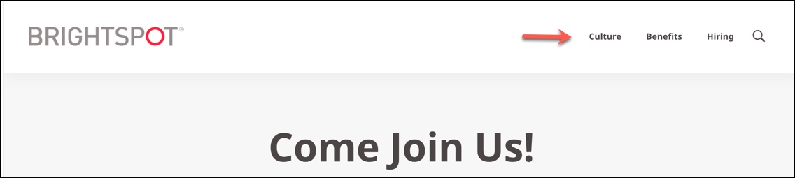
Navigation items are the links that show up in the navigation to direct readers to different areas of content.
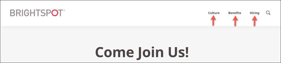
There are three types of navigation items you can add:
- Simple Navigation Item—A simple link to an internal Brightspot asset, website, or a site search.
- Social Navigation Item—A link to a page within a social media site, such as Facebook.
- User Profile Navigation Item—A link that prompts the reader to log in to a site to access additional content.
To add navigation items to the navigation:
- Click in the Items field.
- Select which type of navigation item you would like to add.
- Depending on your selection, refer to the following table for more information about the navigation item.
- Click Save.
Simple Navigation Item fields
- Main
- Sub-Navigation
- Styles
| Field | Description |
|---|---|
| Main tab | |
| Title | Select one of the following options from the list:
|
| Text | Enter the name of this simple navigation item's link or text. |
| Description | Enter a description of this simple navigation item to accompany its link. |
| Link | Select an internal or external asset for the simple navigation item's link. |
| Field | Description |
|---|---|
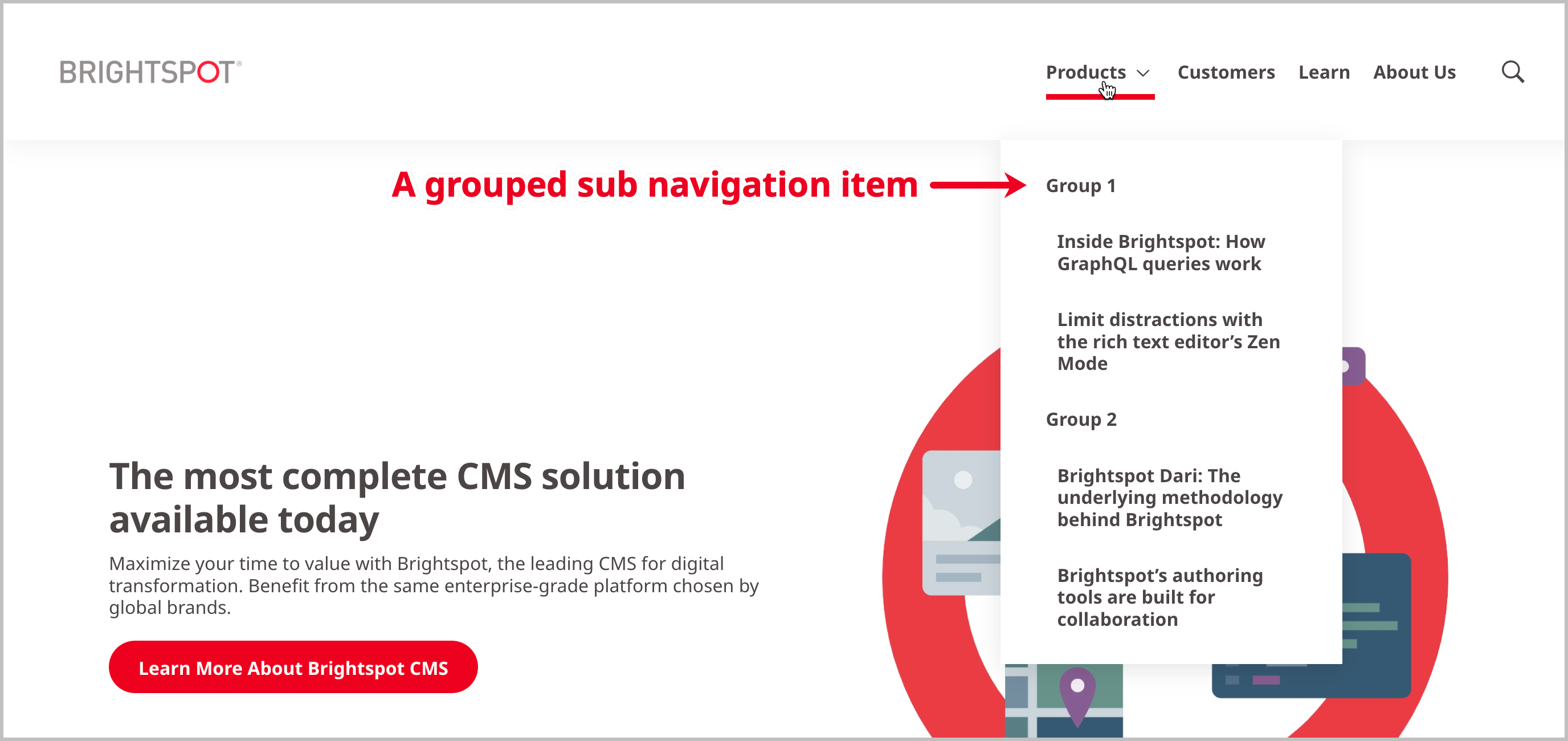
| Sub Navigation | Click and select one of the following options from the list:
|
| Field | Description |
|---|---|
| Preset | Select:
|
| Choose how many navigation dropdown columns you would like | Select a number to specify how many columns you want the items in your navigation divided into. |
| Check to choose a mosaic style layout for the navigation group | Toggle on, to order your links vertically in the navigation.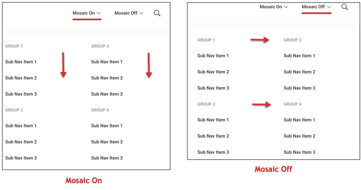 |
| Should this nav item show up as a button | Toggle on to display the navigation item as a button. |
Social Navigation Item fields
| Field | Description |
|---|---|
| Social Service | Select a social network provider from the list. Brightspot displays the icon of the social service provider you select. |
| Text | Enter text to accompany the social network provider icon. |
| URL | Enter the URL of the post from the social network. |
User Profile Navigation Item fields
- Main
- Styles
| Field | Description |
|---|---|
| Login Page | Select a login page from the list. For details on how to create a login page, see Login page. |
| Log In Navigation Text | Enter text that is displayed in the navigation that prompts the visitor to log in. |
| Profile Sub Navigation | Click and select one of the following options from the list:
|
| Field | Description |
|---|---|
| Preset | Select:
|
| Choose how many navigation dropdown columns you would like | Select a number to specify how many columns you want the items in your navigation divided into. |
| Check to choose a mosaic style layout for the navigation group | Toggle on, to order your links vertically in the navigation. |
| Should this nav item show up as a button | Toggle on to display the navigation item as a button. |