List modules
List modules allow you to display promos of assets in a list. There are general-purpose list modules (like basic, advanced, and dynamic lists) and content-type specific lists (like logo lists, product lists, stat lists, and more).
- Basic list modules—A list of any type of asset promo, the titles and descriptions of which you cannot override.
- Advanced list modules—A list of specific types of asset promos, the titles and descriptions of which you can override.
- Dynamic list modules—A list of any type of asset promo, the contents of which are populated dynamically based on the settings you select.
Creating list modules
For a wire frame example of what this content type can look like on your site, see List module design.
To create a list module:
- In the header, click .
- From the Create list, select List Module.
- Using the following table as a reference, complete the fields as needed.
- Complete your site's workflow and publish the list module.
Standard list fields
While different list modules serve different purposes, they often contain the same configuration fields. See the table below for information on these fields.
- Main
- Advanced
- Overrides
- Styles
| Field | Description |
|---|---|
| Internal Name | Enter an internal name for this asset. Brightspot uses this name internally, such as in the search panel and recent activity widget. This name is not visible to visitors to your site. |
| Title | Enter a title for this asset. This title is visible to the visitors to your site. |
| Description | Describe the list. This description is visible to the visitors to your site. |
| Items | See the various sections in this topic for details on what to select for this field. |
| Call To Action | Select None (no call to action is displayed), Internal (the call to action links to an internal asset), or External (the call to action links to an external asset). For internal and external options, you can configure whether the link opens in the same tab or in a new tab. For internal assets only, you can link to a specific anchor on a page. |
| Call To Action Button Text | Enter text that gets a user to click on the call to action button. |
| Field | Description |
|---|---|
| Exclude Content from De-Duplication | By default, Brightspot ensures the items in a dynamic list appear only once on the same page. Toggle this setting on to allow items in a dynamic list to duplicate other items on a page. |
| Field | Description |
|---|---|
| Anchor | Modify the anchor to something that would make sense when appearing in an Anchor field's drop-down menu on another asset. This allows you to directly link to this module in another asset. Being specific makes it easier to identify in a list of other anchors. |
Advanced
| Field | Description |
|---|---|
| Hide Descriptions | Toggle on to hide the descriptions of the assets contained in the list module. For example, toggling on this setting displays the Headline of an article, but hides the Description of an article contained in the list module. |
| Hide Images | Toggle on to hide the images included on the assets contained in the list module. |
| Hide Publish Dates | Toggle on to hide the publish dates of the assets included in the list module. |
| Hide Categories | Toggle on to hide the categories of the assets included in the list module. |
| Hide Authors | Toggle on to hide the authors of the assets included in the list module. |
Page List Styles
| Field | Description |
|---|---|
| Template | Select the template of this module from the list of options. Templates are visual presentation presets that differ depending on the type of module. |
| Preset | Select one of the following: - None—Applies styling from the site's theme. - Custom—Opens a form to customize the site's theme for this asset. - (Various)—Aside from None or Custom, there may be additional options in this list depending on the value selected in the Template field. If the selected template has presets, then those presets are able to be selected in this list and applied. For information about configuring template presets, see Creating a template preset. |
| List Title Size | Overrides the default text size of the list's Title as specified in your theme's CSS file. |
| List Description Size | Overrides the default text size of the list's Description as specified in your theme's CSS file. |
| Choose a Background Color | Enter the hexadecimal value of a background color for this module. For instance, entering #000888 provides a dark blue background. |
| Change Primary Text Color to Primary Inverse Text Color (Set in Theme Colors) | Toggle on to convert the primary color of the text in the module to the inverse color of the text set in the theme. |
| Module Padding Top | Overrides the default padding at the top of the module as specified in your theme's CSS file. You can choose from None, Small, Medium, or Large. |
| Module Padding Bottom | Overrides the default padding at the bottom of the module as specified in your theme's CSS file. You can choose from None, Small, Medium, or Large. |
Basic lists
Basic lists contain assets of any content type. The assets in the list do not change unless you explicitly change them.
A basic list renders promos of the list's underlying assets, and you cannot override the promos' text or image. (Changes to the assets' promos appear in the rendered basic list.)
Basic lists contain all standard list fields. See the table below for how to specifically configure a basic list.
| Field | Description |
|---|---|
| Items | Select Basic and then click Add Item. From the content picker, select the assets to include in the list. In a basic list, you cannot override the asset's values like title, description, etc. |
Advanced lists
Advanced lists can contain a variety of different kinds of modules. The assets in the list do not change unless you explicitly change them.
If your advanced list includes promos, you can customize the promos' text and image. (Your customizations remain even if an asset's promo changes.) Basic lists also contain promos of the list's underlying assets, but you cannot customize the promos' text and image.
Advanced lists contain all standard list fields. See the table below for how to specifically configure an advanced list.
| Field | Description |
|---|---|
| Items | Select Advanced and then click Add. Select an option from the list (Ad module, Dynamic Promo, HTML Embed Module, Iframe Embed Module, Promo). Once you make your selection, search for the modules you want to include in the list, and for dynamic promos and promos, override any default values if desired. |
Dynamic lists
Dynamic lists contain assets of any content type. The assets in the list change depending on the selection of sort and filtering criteria you configure. See Dynamic list settings for details.
Dynamic lists contain all standard list fields. See the table below for how to specifically configure a dynamic list.
| Field | Description |
|---|---|
| Items | Select Dynamic. The fields that appear after this selection determine what assets dynamically populate the list. See Dynamic list settings for details. |
Dynamic list settings
Dynamic lists populate list items (like assets and landing pages) automatically on your site according to a combination of settings and filters. This section explains the dynamic list settings available in Brightspot.
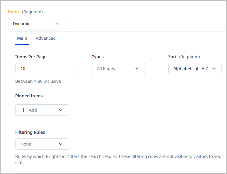
Types
Select the pool of content types from which Brightspot pulls to generate the dynamic list.
Sort
Select by what order the dynamic list is sorted. The following options are available:
- Alphabetical - A-Z—Sorts the dynamic list in alphabetical order from A to Z.
- Alphabetical - Z-A—Sorts the dynamic list in reverse alphabetical order from Z to A.
- Newest Publish Date—Sorts the dynamic list by newest publish date.
- Oldest Publish Date—Sorts the dynamic list by oldest publish date.
If you have configured analytics for your site, you can also sort by page views.
Items Per Page
Determines how many list items are displayed in the dynamic list. Brightspot supports 1-30 list items per page.
Filtering Rules
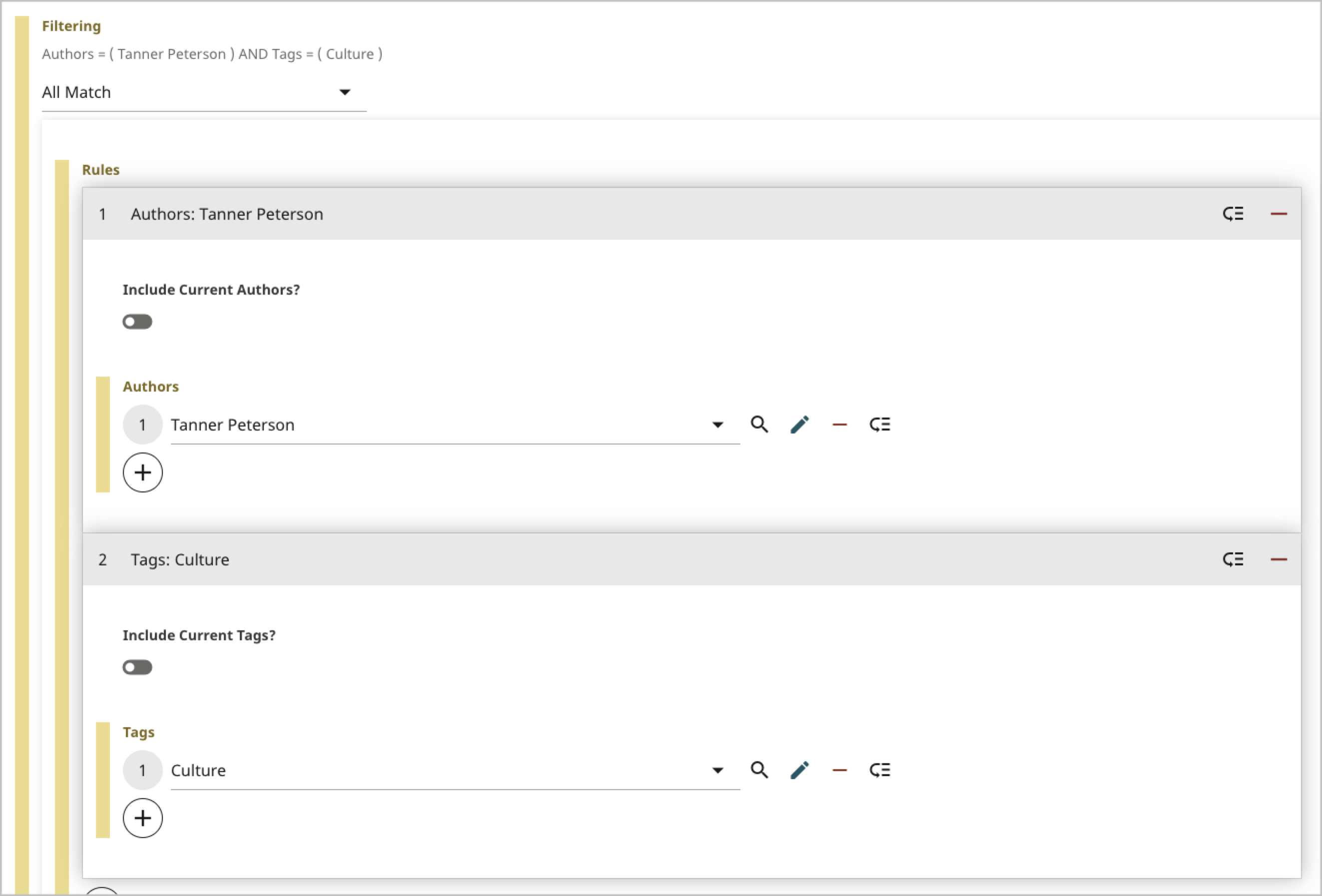
Filtering applies rules that a list item must satisfy to be included in the dynamic list. The following filters are available
| Filter | Description |
|---|---|
| None | No filters are applied to the dynamic list. |
| All Match | List items must match all rules. When scanning for items to include in the list, Brightspot only includes those items that match the all the rules. For example, a visitor is viewing an article that contains this list. The list includes list items that match each of the following rules together:
 |
| Any Match | List items must match at least one rule. When scanning for items to include in the list, Brightspot includes any items that match at least one rule. For example, a visitor is viewing an article that contains this list. The list includes any list items that match either one of the following rules:
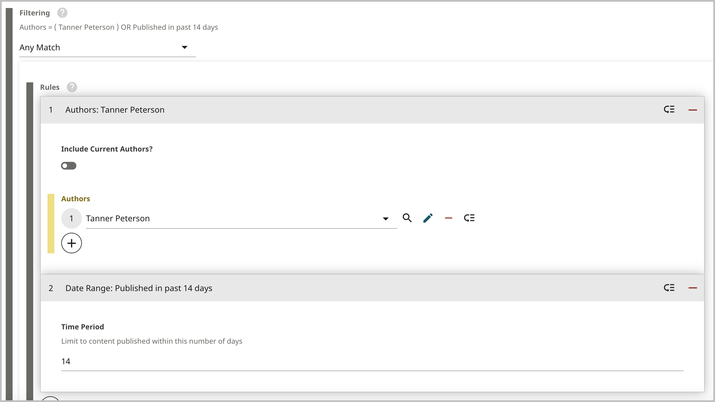 |
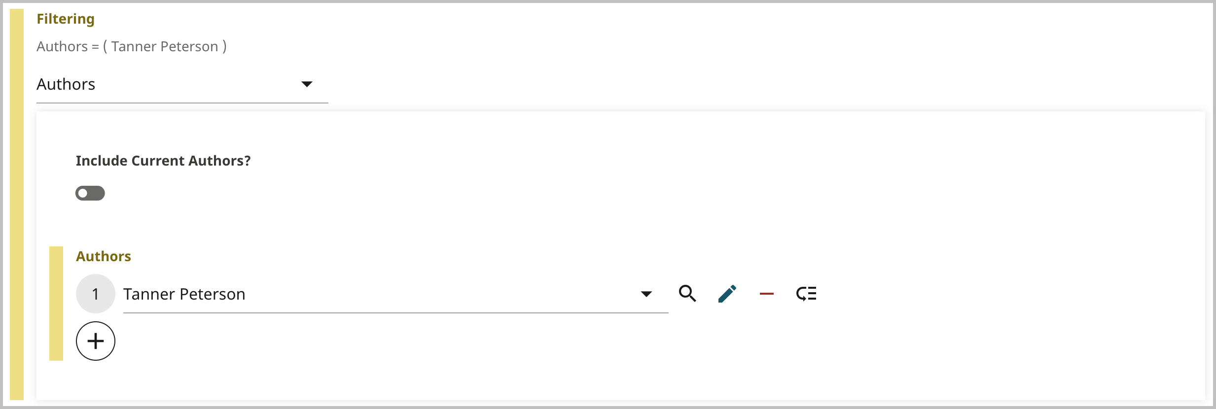
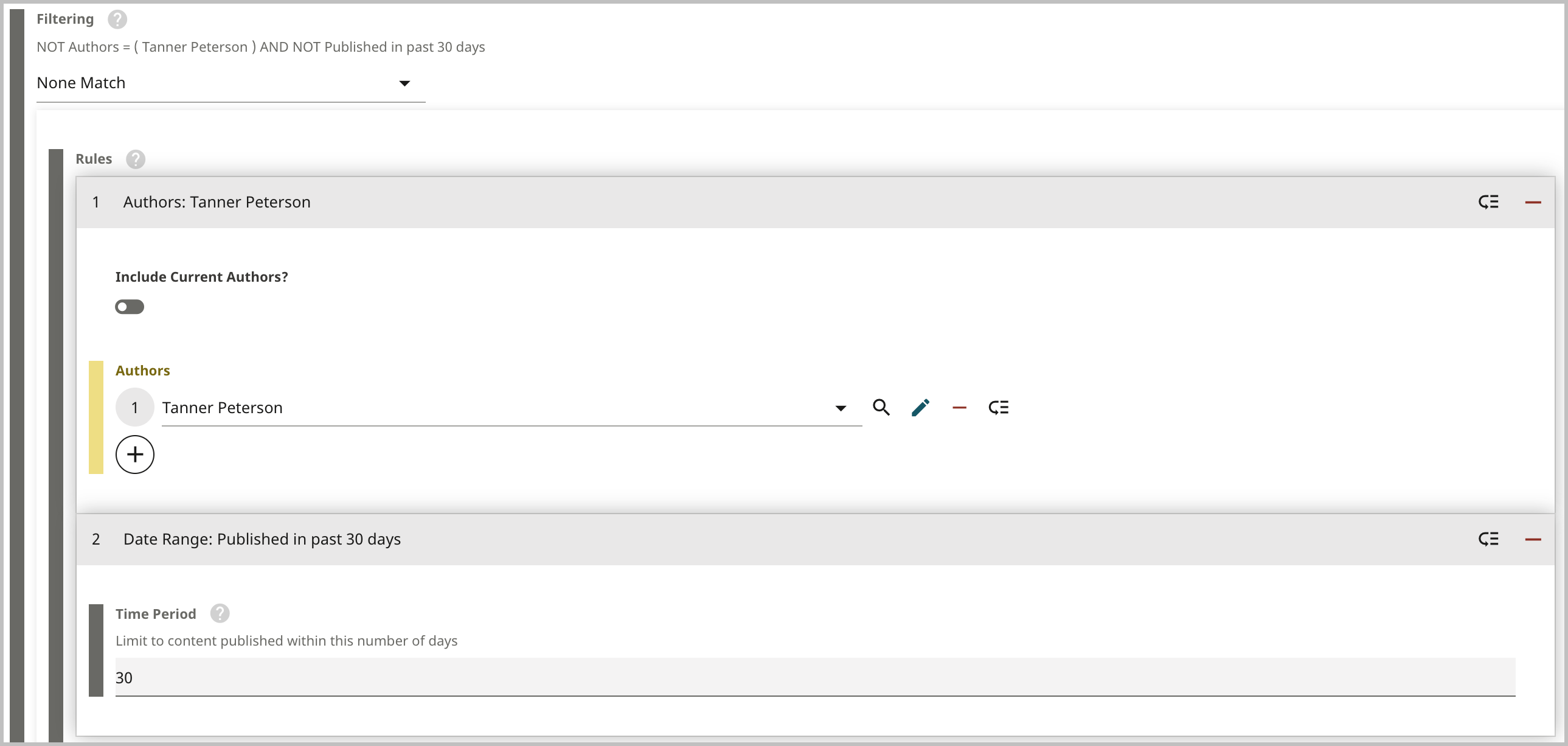
| Authors | List items must be associated with the selected authors. When scanning for items to include in the list, Brightspot includes only those list items that are associated with the selected authors. For example, a visitor is viewing an article that contains this list. This list includes list items that are associated with the following author:
 |
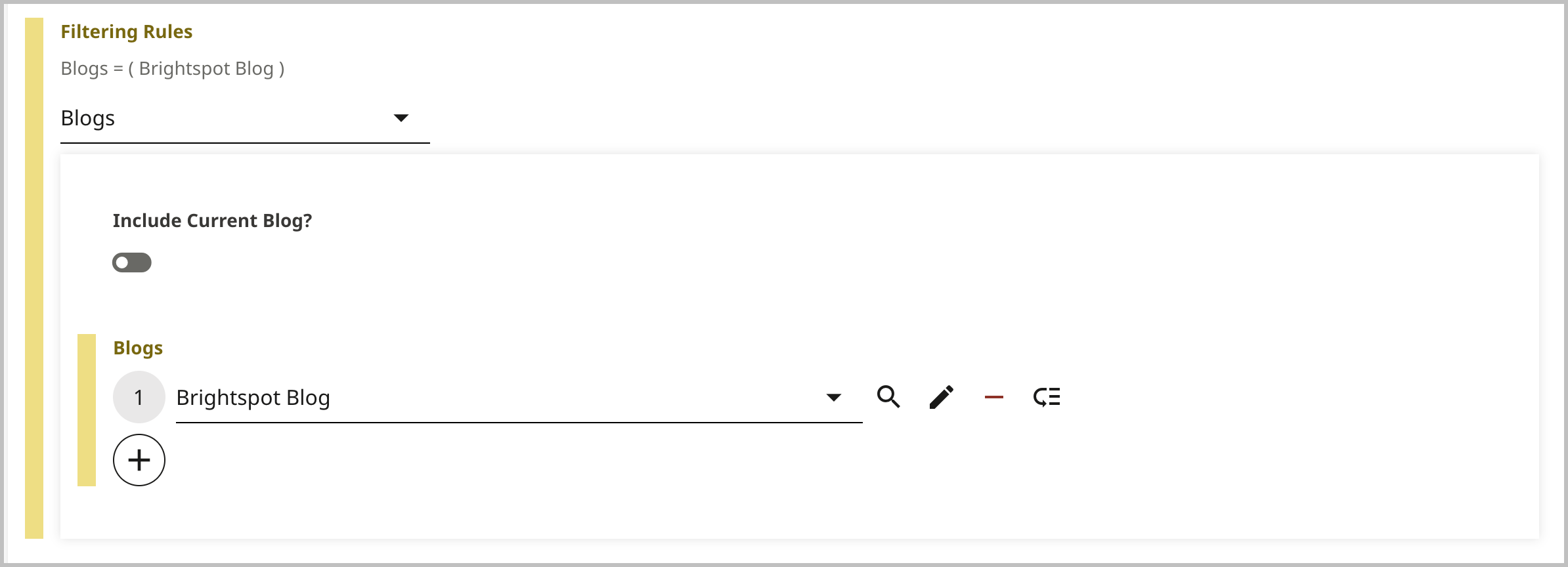
| Blogs | List items must be associated with the selected blog. When scanning for items to include in the list, Brightspot includes only those list items that are associated with the selected blogs. For example, a visitor is viewing an article that contains this list. This list includes list items that are associated with the following blog:
 |
| Date Range | List items must match the time period specified in the filter. When scanning for items to include in the list, Brightspot includes only those items published during the specified time period. For example, a visitor is viewing an article that contains this list. The list includes list items that were published in the last 14 days. 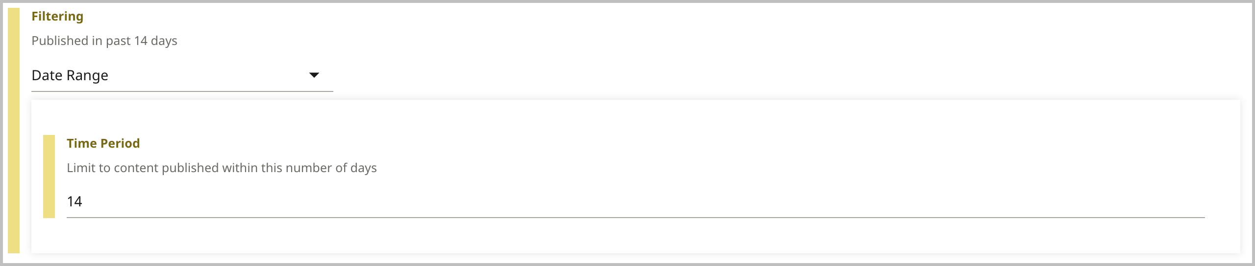 |
| None Match | List items must exclude all rules. When scanning for items to include in the list, Brightspot only includes those items that do not match the specified rules. For example, if a visitor is viewing an article that contains this list, the list includes list items that do not match the following rules:
 |
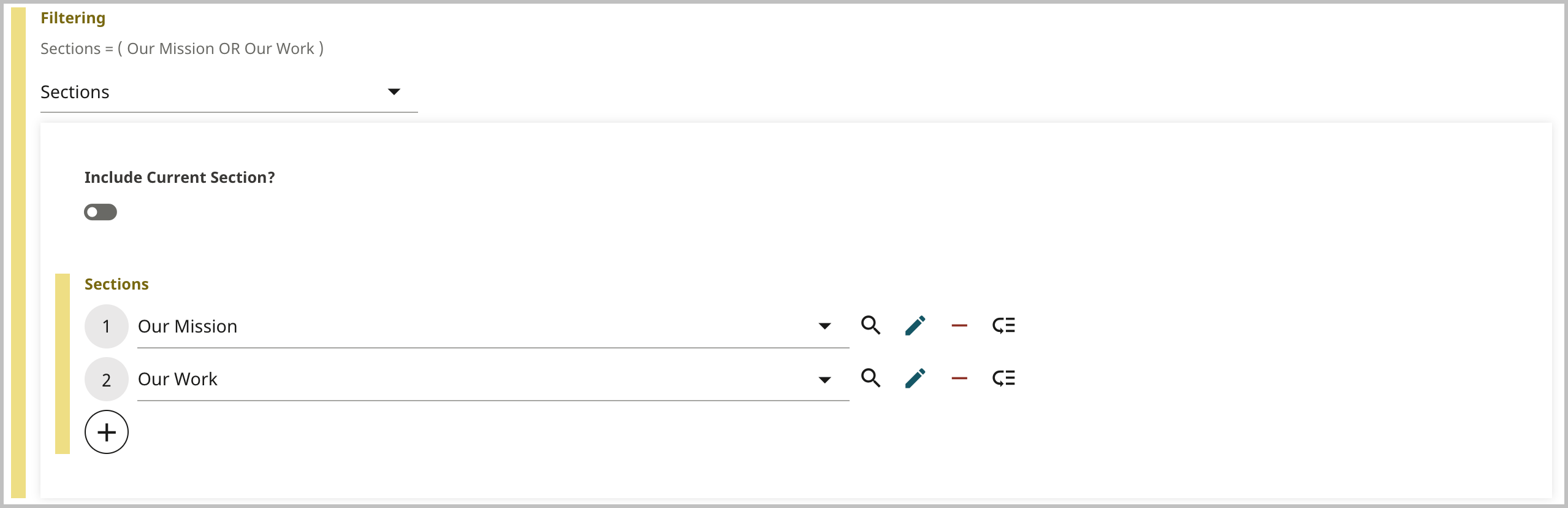
| Sections | List items must be associated with the sections specified in the filter. For example, a visitor is viewing an article that contains this list. The list includes list items associated with the following sections:
 |
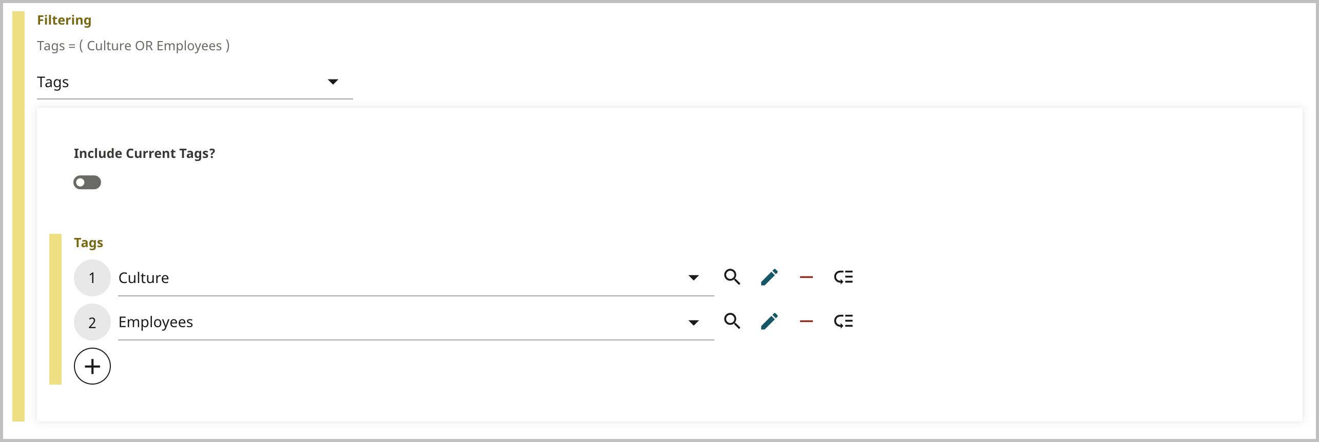
| Tags | List items must be associated with the tags selected in the filter. When scanning for items to include in this list, Brightspot includes only those items that match the specified tags. For example, a visitor is viewing an article that contains this list. The list includes list items that match the following tags:
 |
| Include Current toggle | When an editor builds a dynamic list, filters determine what populates the list. Some filters include an Include Current toggle. One such filter is Authors. Below is an example of how this functionality works with the Authors filter. You are an editor, and one of your staff has just written an article. You want the readers of this article to see other articles that the author has written; however, you also want two other things:
The Include Current toggle also exists in the Tags and Sections filters. In both cases, Brightspot checks the tag or section associated to the asset a visitor is currently viewing, then populates the list with other assets that share this tag or section. |
Pinned Items
Allows you to pin the following list items to the top of the dynamic list so that they are always visible:
- Ad Module—Allows you to pin an ad to the top of the dynamic list.
- Dynamic Page Result—Allows you to pin a placeholder among your other pinned list items that defaults to another dynamically generated result. Use this when you want a dynamically generated list item in between other pinned list items.
- Dynamic Promo—Allows you to dynamically inject a promo in the top of the list. For example, you may want to dynamically inject the most viewed article in the top of the list, but leave the rest based on tag.
- HTML Embed Module—Allows you to pin embedded HTML.
- Iframe Embed Module—Allows you to pin an embedded Iframe.
- Promo—Allows you to pin a promo module. You can set an expiration date for these promos, after which the promos are no longer visible on your site, and after which the promos are removed from the list module in Brightspot.
Related content lists
Related Content list modules contain article assets that are related to the asset you specify.
| Field | Description |
|---|---|
| Items | Select Related Content. |
| Source | Select a source for the related content from one of the following options:
|
Attachment Lists
An attachment list module allows you to collect attachments into a list module. There are two types of attachment list modules: advanced (the list's assets do not change) and dynamic (the list's assets change based on selection criteria).
For a wire frame example of what this content type can look like on your site, see Attachment List module design.
To create an attachment list module:
- In the header, click .
- From the Create list, select Attachment List Module.
- Using the following table as a reference, complete the fields as needed.
- Complete your site's workflow and publish the asset.
- Main
- Styles
| Field | Description |
|---|---|
| Items | Select one of the following: - Advanced—Displays promos of attachments. For information about configuring an advanced attachment list, see Advanced attachment list modules, below. - Dynamic—Displays a dynamic list of attachments. For information about configuring a dynamic list, see Understanding dynamic list settings. |
Advanced
| Field | Description |
|---|---|
| Hide Descriptions | Toggle on to hide the descriptions of the assets contained in the list module. For example, toggling on this setting displays the Headline of an article, but hides the Description of an article contained in the list module. |
| Hide File Sizes | Toggle on to hide the file size for any attachments to the Attachment List Module. |
Download List Styles
| Field | Description |
|---|---|
| Template | Select the template of this module from the list of options. Templates are visual presentation presets that differ depending on the type of module. |
| Preset | Select one of the following: - None—Applies styling from the site's theme. - Custom—Opens a form to customize the site's theme for this asset. - (Various)—Aside from None or Custom, there may be additional options in this list depending on the value selected in the Template field. If the selected template has presets, then those presets are able to be selected in this list and applied. For information about configuring template presets, see Creating a template preset. |
| Choose a Background Color | Enter the hexadecimal value of a background color for this module. For instance, entering #000888 provides a dark blue background. |
| Use Text Colors | Select the color to use for text. - Standard—Use the text color specified in the site's theme. - Inverse—Use the inverse of the text color specified in the site's theme. |
| Color Scheme | Select the color scheme to use for this page. - Standard—Use the text color specified in the site's theme. - Inverse—Use the inverse of the text color specified in the site's theme. |
| Change Primary Text Color to Primary Inverse Text Color (Set in Theme Colors) | Toggle on to convert the primary color of the text in the module to the inverse color of the text set in the theme. |
| List Title Size | Overrides the default text size of the list's Title as specified in your theme's CSS file. |
| List Description Size | Overrides the default text size of the list's Description as specified in your theme's CSS file. |
| Header Text Alignment | Overrides the default alignment of the header as specified in your theme's CSS file. You can choose from Left, Center, or Right. |
| Call to Action Alignment | Overrides the default alignment of the call to action button as specified in your theme's CSS file. Your choices are Left, Center, and Right, and determines where in the asset the call to action button is displayed. |
| Item Display Style | Overrides the default display style of the items included in your list as specified in your theme's CSS file. |
| Choose an Item Background Color | Open the color picker to override the default background color for the items included on the asset. |
| Item Background Image | Overrides the default background image for each item included on the asset. You can open the content selector to choose a background image or create a new one if needed. |
| Item Text Color | Open the color picker to override the default text color for the items included on the asset. |
| Item Title Alignment | Overrides the default alignment of the Title for each item on the asset as specified in your theme's CSS file. Your choices are Left, Center, and Right, and determines where, above each item, the item Title is displayed. |
| Item Description Alignment | Overrides the default alignment of the Description for each item on the asset as specified in your theme's CSS file. Your choices are Left, Center, and Right, and determines where, on the items, the Description is displayed. |
| Item CTA Alignment | Overrides the default alignment of the call to action button as specified in your theme's CSS file. Your choices are Left, Center, and Right, and determines where in the asset the call to action button is displayed. |
| Item Image Aspect Ratio | Overrides the default size and shape of the image next to the items in the asset as specified in your theme's CSS file. |
| Module Padding Top | Overrides the default padding at the top of the module as specified in your theme's CSS file. You can choose from None, Small, Medium, or Large. |
| Module Padding Bottom | Overrides the default padding at the bottom of the module as specified in your theme's CSS file. You can choose from None, Small, Medium, or Large. |
Author lists
This section describes how to create an author list module.
For a wire frame example of what this content type can look like on your site, see Author List module design.
To create an author list module:
- In the header, click .
- From the Create list, select Author List Module.
- Using the following table as a reference, complete the fields as needed.
- Complete your site's workflow and publish the author list module.
- Main
- Overrides
- Styles
| Field | Description |
|---|---|
| Internal Name | Enter an internal name for this asset. Brightspot uses this name internally, such as in the search panel and recent activity widget. This name is not visible to visitors to your site. |
| Title | Enter a title for this asset. This title is visible to the visitors to your site. |
| Description | Enter a description. This description is not visible to visitors to your site. |
| Items | Select one of the following: - Basic—Adds authors to the list. A rendered basic list includes promos of the underlying authors, and you cannot override the promos' text or image. (Changes to the authors' promos appear in the rendered basic list.) - Advanced—Adds authors' promos to the list. You can customize the promos' text and image. Your customizations remain even if an author's promo changes. See Author for information on creating a new author. |
| Call To Action | Select None, Internal or External. - None—No call to action button is displayed. - Internal—A call to action button is displayed that links to an internal asset. - External—A call to action button is displayed that links to an external URL. When setting up an internal or external call to action, you have the option to set how the link will behave. Select either Internal or External, then specify a target or, for internal links only, an anchor to which you link visitors. Each option also allows you to define Name and Value attributes, the latter of which appends an additional parameter to the URL (for example, if you input Brightspot Home Page. into the Value field, appends Title="Brightspot Home Page" to the URL of the external link specified in the call to action). |
| Call to Action Button Text | Enter text appearing on the call-to-action button. This text is visible to the visitors to your site. |
| Field | Description |
|---|---|
| Anchor | Modify the anchor to something that would make sense when appearing in an Anchor field's drop-down menu on another asset. This allows you to directly link to this module in another asset. Being specific makes it easier to identify in a list of other anchors. |
Advanced
| Field | Description |
|---|---|
| Hide Job Titles | Toggle on to suppress the display of the job titles of the individuals included in the list module. |
| Hide Images | Toggle on to hide the images included on the assets contained in the list module. |
Author List Styles
| Field | Description |
|---|---|
| Template | Select the template of this module from the list of options. Templates are visual presentation presets that differ depending on the type of module. |
| Preset | Select one of the following: - None—Applies styling from the site's theme. - Custom—Opens a form to customize the site's theme for this asset. - (Various)—Aside from None or Custom, there may be additional options in this list depending on the value selected in the Template field. If the selected template has presets, then those presets are able to be selected in this list and applied. For information about configuring template presets, see Creating a template preset. |
| List Title Size | Overrides the default text size of the list's Title as specified in your theme's CSS file. |
| List Description Size | Overrides the default text size of the list's Description as specified in your theme's CSS file. |
| Header Text Alignment | Overrides the default alignment of the header as specified in your theme's CSS file. You can choose from Left, Center, or Right. |
| Item Author Name Alignment | Overrides the default alignment of the Name for each author on the asset, as specified in your theme's CSS file. Your choices are Left, Center, and Right, and determines where the author's name is displayed. |
| Item Job Title Alignment | Overrides the default alignment of the Job Title for each individual on the asset, as specified in your theme's CSS file. Your choices are Left, Center, and Right, and determines where the individual's Job Title is displayed. |
| Item Display Style | Overrides the default display style of the items included in your list as specified in your theme's CSS file. |
| Choose an Item Background Color | Open the color picker to override the default background color for the items included on the asset. |
| Use Text Colors | Select the color to use for text. - Standard—Use the text color specified in the site's theme. - Inverse—Use the inverse of the text color specified in the site's theme. |
| Color Scheme | Select the color scheme to use for this page. - Standard—Use the text color specified in the site's theme. - Inverse—Use the inverse of the text color specified in the site's theme. |
| Item Background Image | Overrides the default background image for each item included on the asset. You can open the content selector to choose a background image or create a new one if needed. |
| Item Text Color | Open the color picker to override the default text color for the items included on the asset. |
| Module Padding Top | Overrides the default padding at the top of the module as specified in your theme's CSS file. You can choose from None, Small, Medium, or Large. |
| Module Padding Bottom | Overrides the default padding at the bottom of the module as specified in your theme's CSS file. You can choose from None, Small, Medium, or Large. |
| Item Image Aspect Ratio | Overrides the default size and shape of the image next to the items in the asset as specified in your theme's CSS file. |
Logo lists
This section describes how to create a logo list.
For a wire frame example of what this content type can look like on your site, see Logo list module design.
To create a logo list:
- In the header, click .
- From the Create list, select Logo List Module.
- Using the following table as a reference, complete the fields as needed.
- Complete your site's workflow and publish the asset.
- Main
- Overrides
- Styles
| Field | Description |
|---|---|
| Internal Name | Enter an internal name for this asset. Brightspot uses this name internally, such as in the search panel and recent activity widget. This name is not visible to visitors to your site. |
| Title | Enter a title for this asset. This title is visible to the visitors to your site. |
| Description | Enter a description that describes this asset. This description is visible to the visitors to your site. |
| Items | Click below the Items field and use the content picker to select the logo assets you want to add to this logo list. You also have the option to create new logo assets from this menu. See Logo for information on creating a new logo. |
| Call To Action | Select None, Internal or External. - None—No call to action button is displayed. - Internal—A call to action button is displayed that links to an internal asset. - External—A call to action button is displayed that links to an external URL. When setting up an internal or external call to action, you have the option to set how the link will behave. Select either Internal or External, then specify a target or, for internal links only, an anchor to which you link visitors. Each option also allows you to define Name and Value attributes, the latter of which appends an additional parameter to the URL (for example, if you input Brightspot Home Page. into the Value field, appends Title="Brightspot Home Page" to the URL of the external link specified in the call to action). |
| Call To Action Button Text | Enter text appearing on the call-to-action button. This text is visible to the visitors to your site. |
| Field | Description |
|---|---|
| Anchor | Modify the anchor to something that would make sense when appearing in an Anchor field's drop-down menu on another asset. This allows you to directly link to this module in another asset. Being specific makes it easier to identify in a list of other anchors. |
Logo List Styles
| Field | Description |
|---|---|
| Template | Select the template of this module from the list of options. Templates are visual presentation presets that differ depending on the type of module. |
| Preset | Select one of the following:
|
| List Title Size | Overrides the default text size of the list's Title as specified in your theme's CSS file. |
| List Description Size | Overrides the default text size of the list's Description as specified in your theme's CSS file. |
| Choose a Background Color | Enter the hexadecimal value of a background color for this module. For instance, entering #000888 provides a dark blue background. |
| Change Primary Text Color to Primary Inverse Text Color (Set in Theme Colors) | Toggle on to convert the primary color of the text in the module to the inverse color of the text set in the theme. |
| Item Display Style | Overrides the default display style of the items included in your list as specified in your theme's CSS file. |
| Choose an Item Background Color | Open the color picker to override the default background color for the items included on the asset. |
| Use Text Colors | Select the color to use for text.
|
| Color Scheme | Select the color scheme to use for this page.
|
| Item Background Image | Overrides the default background image for each item included on the asset. You can open the content selector to choose a background image or create a new one if needed. |
| Item Image Aspect Ratio | Overrides the default size and shape of the image next to the items in the asset as specified in your theme's CSS file. |
| Header Text Alignment | Overrides the default alignment of the header as specified in your theme's CSS file. You can choose from Left, Center, or Right. |
| Module Padding Top | Overrides the default padding at the top of the module as specified in your theme's CSS file. You can choose from None, Small, Medium, or Large. |
| Module Padding Bottom | Overrides the default padding at the bottom of the module as specified in your theme's CSS file. You can choose from None, Small, Medium, or Large. |
News RSS feed lists
You can display RSS feeds as promos on your site by creating a News RSS Feed List module. An external RSS feed must first exist. For details, see External RSS Feed.
To create a News RSS feed list module:
- In the header, click .
- From the Create list, select News RSS Feed List.
- Using the following table as a reference, complete the fields as needed.
- Complete your site's workflow and publish the asset.
- Main
- Styles
| Field | Description |
|---|---|
| Feed | Select an existing external RSS feed. For details, see External RSS Feed. |
| Title | Enter text to override the existing title that is automatically generated from the feed. |
| Description | Enter text to override the existing description that is automatically generated from the feed. |
| Feed Limit | Enter a number to serve as the maximum number of feed items to display in the list. |
Page List Styles
| Field | Description |
|---|---|
| Template | Select the template of this module from the list of options. Templates are visual presentation presets that differ depending on the type of module. |
| Preset | Select one of the following: - None—Applies styling from the site's theme. - Custom—Opens a form to customize the site's theme for this asset. - (Various)—Aside from None or Custom, there may be additional options in this list depending on the value selected in the Template field. If the selected template has presets, then those presets are able to be selected in this list and applied. For information about configuring template presets, see Creating a template preset. |
| List Title Size | Overrides the default text size of the list's Title as specified in your theme's CSS file. |
| List Description Size | Overrides the default text size of the list's Description as specified in your theme's CSS file. |
| Choose a Background Color | Enter the hexadecimal value of a background color for this module. For instance, entering #000888 provides a dark blue background. |
| Use Text Colors | Select the color to use for text. - Standard—Use the text color specified in the site's theme. - Inverse—Use the inverse of the text color specified in the site's theme. |
| Color Scheme | Select the color scheme to use for this page. - Standard—Use the text color specified in the site's theme. - Inverse—Use the inverse of the text color specified in the site's theme. |
| Module Padding Top | Overrides the default padding at the top of the module as specified in your theme's CSS file. You can choose from None, Small, Medium, or Large. |
| Module Padding Bottom | Overrides the default padding at the bottom of the module as specified in your theme's CSS file. You can choose from None, Small, Medium, or Large. |
Person lists
A person list allows you to display several person assets together.
For a wire frame example of what this content type can look like on your site, see Person list module design.
To create a person list:
- In the header, click .
- From the Create list, select Person List Module.
- Using the following table as a reference, complete the fields as needed.
- Complete your site's workflow and publish the person list module.
- Main
- Overrides
- Styles
| Field | Description |
|---|---|
| Internal Name | Enter an internal name for this asset. Brightspot uses this name internally, such as in the search panel and recent activity widget. This name is not visible to visitors to your site. |
| Title | Enter a display name. This name is visible to the visitors to your site. |
| Description | Enter a description that describes this asset. This description is visible to the visitors to your site. |
| Items | Select one of the following: - Basic—Creates a list of persons. - Advanced—Creates a list of person promos. Click below the Items field and use the content picker to select the person assets you want to add to this list. You also have the option to create new person assets from this menu as well. See Person for more information on creating a person asset. |
| Call to Action | Select either Internal or External. Depending on your choice, enter an internal link or external link for the call to action. The call to action is visible to the visitors to your site. |
| Call to Action Button Text | Enter text appearing on the call-to-action button. This text is visible to the visitors to your site. |
| Field | Description |
|---|---|
| Anchor | Modify the anchor to something that would make sense when appearing in an Anchor field's drop-down menu on another asset. This allows you to directly link to this module in another asset. Being specific makes it easier to identify in a list of other anchors. |
Advanced
| Field | Description |
|---|---|
| Hide Biographies | Toggle on to hide the Short Biography information for the individuals included on the list. |
| Hide Job Titles | Toggle on to suppress the display of the job titles of the individuals included in the list module. |
| Hide Images | Toggle on to hide the images included on the assets contained in the list module. |
Person List Styles
| Field | Description |
|---|---|
| Template | Select the template of this module from the list of options. Templates are visual presentation presets that differ depending on the type of module. |
| Preset | Select one of the following: - None—Applies styling from the site's theme. - Custom—Opens a form to customize the site's theme for this asset. - (Various)—Aside from None or Custom, there may be additional options in this list depending on the value selected in the Template field. If the selected template has presets, then those presets are able to be selected in this list and applied. For information about configuring template presets, see Creating a template preset. |
| Choose a Background Color | Enter the hexadecimal value of a background color for this module. For instance, entering #000888 provides a dark blue background. |
| Change Primary Text Color to Primary Inverse Text Color (Set in Theme Colors) | Toggle on to convert the primary color of the text in the module to the inverse color of the text set in the theme. |
| Header Text Alignment | Overrides the default alignment of the header as specified in your theme's CSS file. You can choose from Left, Center, or Right. |
| Call to Action Alignment | Overrides the default alignment of the call to action button as specified in your theme's CSS file. Your choices are Left, Center, and Right, and determines where in the asset the call to action button is displayed. |
| Item Title Alignment | Overrides the default alignment of the Title for each item on the asset as specified in your theme's CSS file. Your choices are Left, Center, and Right, and determines where, above each item, the item Title is displayed. |
| Item Description Alignment | Overrides the default alignment of the Description for each item on the asset as specified in your theme's CSS file. Your choices are Left, Center, and Right, and determines where, on the items, the Description is displayed. |
| Item Image Alignment | Overrides the default image alignment as specified in your theme's CSS file. Your choices are Left or Right, and determine where the image for each item displays on the list. |
| Item Image Aspect Ratio | Overrides the default size and shape of the image next to the items in the asset as specified in your theme's CSS file. |
| Item Display Style | Overrides the default display style of the items included in your list as specified in your theme's CSS file. |
| Choose an Item Background Color | Open the color picker to override the default background color for the items included on the asset. |
| Use Text Colors | Select the color to use for text. - Standard—Use the text color specified in the site's theme. - Inverse—Use the inverse of the text color specified in the site's theme. |
| Color Scheme | Select the color scheme to use for this page. - Standard—Use the text color specified in the site's theme. - Inverse—Use the inverse of the text color specified in the site's theme. |
| Item Background Image | Overrides the default background image for each item included on the asset. You can open the content selector to choose a background image or create a new one if needed. |
| Item Text Color | Open the color picker to override the default text color for the items included on the asset. |
| Module Padding Top | Overrides the default padding at the top of the module as specified in your theme's CSS file. You can choose from None, Small, Medium, or Large. |
| Module Padding Bottom | Overrides the default padding at the bottom of the module as specified in your theme's CSS file. You can choose from None, Small, Medium, or Large. |
Podcast lists
This section describes how to create a podcast episode list. A podcast list allows you to display several podcasts together as a single module.
For a wire frame example of what this content type can look like on your site, see Podcast episode list design.
To create a podcast list:
- In the header, click .
- From the Create list, select Podcast List Module.
- Using the following table as a reference, complete the fields as needed.
- Complete your site's workflow and publish the asset.
- Main
- Overrides
- Styles
| Field | Description |
|---|---|
| Internal Name | Enter an internal name for this asset. Brightspot uses this name internally, such as in the search panel and recent activity widget. This name is not visible to visitors to your site. |
| Title | Enter a title for this asset. This title is visible to the visitors to your site. |
| Description | Enter a description that describes this asset. This description is visible to the visitors to your site. |
| Items | Click below the Items field and use the content picker to select the podcasts you want to add to this podcast list as promos. You also have the option to create new promo assets from this menu. See Podcast for information on creating a new podcast. |
| Call to Action | Select None, Internal or External. - None—No call to action button is displayed. - Internal—A call to action button is displayed that links to an internal asset. - External—A call to action button is displayed that links to an external URL. When setting up an internal or external call to action, you have the option to set how the link will behave. Select either Internal or External, then specify a target or, for internal links only, an anchor to which you link visitors. |
| Call To Action Button Text | Enter text appearing on the call-to-action button. This text is visible to the visitors to your site. |
| Field | Description |
|---|---|
| Anchor | Modify the anchor to something that would make sense when appearing in an Anchor field's drop-down menu on another asset. This allows you to directly link to this module in another asset. Being specific makes it easier to identify in a list of other anchors. |
Advanced
| Field | Description |
|---|---|
| Hide Descriptions | Toggle on to hide the descriptions of the assets contained in the list module. For example, toggling on this setting displays the Headline of an article, but hides the Description of an article contained in the list module. |
| Hide Categories | Toggle on to hide the categories of the assets included in the list module. |
| Hide Images | Toggle on to hide the images included on the assets contained in the list module. |
Podcast List Styles
| Field | Description |
|---|---|
| Template | Select the template of this module from the list of options. Templates are visual presentation presets that differ depending on the type of module. |
| Preset | Select one of the following: - None—Applies styling from the site's theme. - Custom—Opens a form to customize the site's theme for this asset. - (Various)—Aside from None or Custom, there may be additional options in this list depending on the value selected in the Template field. If the selected template has presets, then those presets are able to be selected in this list and applied. For information about configuring template presets, see Creating a template preset. |
| Choose a Background Color | Enter the hexadecimal value of a background color for this module. For instance, entering #000888 provides a dark blue background. |
| Change Primary Text Color to Primary Inverse Text Color (Set in Theme Colors) | Toggle on to convert the primary color of the text in the module to the inverse color of the text set in the theme. |
| Header Text Alignment | Overrides the default alignment of the header as specified in your theme's CSS file. You can choose from Left, Center, or Right. |
| Call to Action Alignment | Overrides the default alignment of the call to action button as specified in your theme's CSS file. Your choices are Left, Center, and Right, and determines where in the asset the call to action button is displayed. |
| Item Category Alignment | Overrides the default Category alignment as specified in your theme's CSS file. Your choices are Left, Center, or Right. |
| Item Title Alignment | Overrides the default alignment of the Title for each item on the asset as specified in your theme's CSS file. Your choices are Left, Center, and Right, and determines where, above each item, the item Title is displayed. |
| Item Description Alignment | Overrides the default alignment of the Description for each item on the asset as specified in your theme's CSS file. Your choices are Left, Center, and Right, and determines where, on the items, the Description is displayed. |
| Item Image Aspect Ratio | Overrides the default size and shape of the image next to the items in the asset as specified in your theme's CSS file. |
| Item Display Style | Overrides the default display style of the items included in your list as specified in your theme's CSS file. |
| Choose an Item Background Color | Open the color picker to override the default background color for the items included on the asset. |
| Use Text Colors | Select the color to use for text. - Standard—Use the text color specified in the site's theme. - Inverse—Use the inverse of the text color specified in the site's theme. |
| Color Scheme | Select the color scheme to use for this page. - Standard—Use the text color specified in the site's theme. - Inverse—Use the inverse of the text color specified in the site's theme. |
| Item Background Image | Overrides the default background image for each item included on the asset. You can open the content selector to choose a background image or create a new one if needed. |
| Item Text Color | Open the color picker to override the default text color for the items included on the asset. |
| Module Padding Top | Overrides the default padding at the top of the module as specified in your theme's CSS file. You can choose from None, Small, Medium, or Large. |
| Module Padding Bottom | Overrides the default padding at the bottom of the module as specified in your theme's CSS file. You can choose from None, Small, Medium, or Large. |
Podcast episode lists
For a wire frame example of what this content type can look like on your site, see Podcast episode list design.
To create a podcast episode list:
- In the header, click .
- From the Create list, select Podcast Episode List Module.
- Using the following table as a reference, complete the fields as needed.
- Complete your site's workflow and publish the asset.
- Main
- Overrides
- Styles
| Field | Description |
|---|---|
| Internal Name | Enter an internal name for this asset. Brightspot uses this name internally, such as in the search panel and recent activity widget. This name is not visible to visitors to your site. |
| Title | Enter a title for this asset. This title is visible to the visitors to your site. |
| Description | Enter a description that describes this asset. This description is visible to the visitors to your site. |
| Items | Click below the Items field and use the content picker to select the podcast episodes you want to add to this podcast episode list as promos. You also have the option to create new promo assets from this menu. See Podcast episode for information on creating a new podcast episode. |
| Call to Action | Select None, Internal or External. - None—No call to action button is displayed. - Internal—A call to action button is displayed that links to an internal asset. - External—A call to action button is displayed that links to an external URL. When setting up an internal or external call to action, you have the option to set how the link will behave. Select either Internal or External, then specify a target or, for internal links only, an anchor to which you link visitors. |
| Call To Action Button Text | Enter text appearing on the call-to-action button. This text is visible to the visitors to your site. |
| Field | Description |
|---|---|
| Anchor | Modify the anchor to something that would make sense when appearing in an Anchor field's drop-down menu on another asset. This allows you to directly link to this module in another asset. Being specific makes it easier to identify in a list of other anchors. |
Advanced
| Field | Description |
|---|---|
| Hide Descriptions | Toggle on to hide the descriptions of the assets contained in the list module. For example, toggling on this setting displays the Headline of an article, but hides the Description of an article contained in the list module. |
| Hide Images | Toggle on to hide the images included on the assets contained in the list module. |
| Hide Publish Dates | Toggle on to hide the publish dates of the assets included in the list module. |
| Hide Media Players | Toggle on to hide the media player controls from displaying in the list. |
Podcast Episode List Styles
| Field | Description |
|---|---|
| Template | Select the template of this module from the list of options. Templates are visual presentation presets that differ depending on the type of module. |
| Preset | Select one of the following: - None—Applies styling from the site's theme. - Custom—Opens a form to customize the site's theme for this asset. - (Various)—Aside from None or Custom, there may be additional options in this list depending on the value selected in the Template field. If the selected template has presets, then those presets are able to be selected in this list and applied. For information about configuring template presets, see Creating a template preset. |
| Choose a Background Color | Enter the hexadecimal value of a background color for this module. For instance, entering #000888 provides a dark blue background. |
| Use Text Colors | Select the color to use for text. - Standard—Use the text color specified in the site's theme. - Inverse—Use the inverse of the text color specified in the site's theme. |
| Color Scheme | Select the color scheme to use for this page. - Standard—Use the text color specified in the site's theme. - Inverse—Use the inverse of the text color specified in the site's theme. |
| Header Text Alignment | Overrides the default alignment of the header as specified in your theme's CSS file. You can choose from Left, Center, or Right. |
| Call to Action Alignment | Overrides the default alignment of the call to action button as specified in your theme's CSS file. Your choices are Left, Center, and Right, and determines where in the asset the call to action button is displayed. |
| Item Display Style | Overrides the default display style of the items included in your list as specified in your theme's CSS file. |
| Choose an Item Background Color | Open the color picker to override the default background color for the items included on the asset. |
| Item Background Image | Overrides the default background image for each item included on the asset. You can open the content selector to choose a background image or create a new one if needed. |
| Item Text Color | Open the color picker to override the default text color for the items included on the asset. |
| Item Byline Alignment | Overrides the default publish date alignment as specified in your theme's CSS file. Your choices are Left or Right, and determine where the publish date for each item displays on the list. |
| Item Title Alignment | Overrides the default alignment of the Title for each item on the asset as specified in your theme's CSS file. Your choices are Left, Center, and Right, and determines where, above each item, the item Title is displayed. |
| Item Description Alignment | Overrides the default alignment of the Description for each item on the asset as specified in your theme's CSS file. Your choices are Left, Center, and Right, and determines where, on the items, the Description is displayed. |
| Item Player Alignment | Overrides the default player button alignment as specified in your theme's CSS file. Your choices are Left, Center, or Right, and determine where the player button for each item displays on the list. |
| Module Padding Top | Overrides the default padding at the top of the module as specified in your theme's CSS file. You can choose from None, Small, Medium, or Large. |
| Module Padding Bottom | Overrides the default padding at the bottom of the module as specified in your theme's CSS file. You can choose from None, Small, Medium, or Large. |
Product lists
You can create a module promoting a list of products.
For a wire frame example of what this content type can look like on your site, see Product List design.
To create a product list module:
- In the header, click .
- From the Create list, select Product List Module.
- Using the following tables as a reference, complete the fields as needed.
- Click Save.
- Main
- Overrides
- Styles
| Field | Description |
|---|---|
| Internal Name | In the Internal Name field, enter an internal name. Brightspot uses this name in selection fields. |
| Title | Enter a title. The title is visible to the visitors to your site. |
| Description | Enter a description. This description is visible to the visitors to your site. |
| Items | Select one of the following: - Basic—Adds products to the list. A rendered basic list includes promos of the underlying products, and you cannot override the promos' text or image. - Advanced—Adds products' promos to the list. You can customize the promos' text and image. Your customizations remain even if a product's promo changes. See Product Promo module for more details on these fields. - Dynamic—Adds products' promos to a list that dynamically updates according to the settings you select. See Understanding dynamic list settings for more information on these settings. |
| Call To Action | The destination when a visitor clicks the call to action button. Select None, Internal or External. - None—No call to action button is displayed. - Internal—A call to action button is displayed that links to an internal asset. - External—A call to action button is displayed that links to an external URL. |
| Call To Action Button Text | In the Call To Action Button Text, enter text appearing on the call-to-action button. This text is visible to the visitors to your site. |
| Field | Description |
|---|---|
| Anchor | Modify the anchor to something that would make sense when appearing in an Anchor field's drop-down menu on another asset. This allows you to directly link to this module in another asset. Being specific makes it easier to identify in a list of other anchors. |
Advanced
| Field | Description |
|---|---|
| Hide Descriptions | Toggle on to hide the descriptions of the assets contained in the list module. For example, toggling on this setting displays the Headline of an article, but hides the Description of an article contained in the list module. |
| Hide Images | Toggle on to hide the images included on the assets contained in the list module. |
| Hide Prices | Toggle on to suppress the display of product prices in this module. |
Product List Styles
| Field | Description |
|---|---|
| Template | Select the template of this module from the list of options. Templates are visual presentation presets that differ depending on the type of module. |
| Preset | Select one of the following: - None—Applies styling from the site's theme. - Custom—Opens a form to customize the site's theme for this asset. - (Various)—Aside from None or Custom, there may be additional options in this list depending on the value selected in the Template field. If the selected template has presets, then those presets are able to be selected in this list and applied. For information about configuring template presets, see Creating a template preset. |
| List Title Size | Overrides the default text size of the list's Title as specified in your theme's CSS file. |
| List Description Size | Overrides the default text size of the list's Description as specified in your theme's CSS file. |
| Choose How Many Columns You Would Like | Select the number of columns to use when laying out this list module. |
| Choose a Background Color | Enter the hexadecimal value of a background color for this module. For instance, entering #000888 provides a dark blue background. |
| Use Text Colors | Select the color to use for text. - Standard—Use the text color specified in the site's theme. - Inverse—Use the inverse of the text color specified in the site's theme. |
| Color Scheme | Select the color scheme to use for this page. - Standard—Use the text color specified in the site's theme. - Inverse—Use the inverse of the text color specified in the site's theme. |
| Choose an Item Background Color | Open the color picker to override the default background color for the items included on the asset. |
| Choose an Item Border Color | Select the color for borders around a product's featured image. |
| Change the item Primary Text Color to Primary Inverse Text Color (Set in Theme Colors) | Toggle on to apply use the theme's inverse text color (instead of the primary text color). For information about configuring a theme's colors, see Customizing a theme. |
| Item Display Style | Overrides the default display style of the items included in your list as specified in your theme's CSS file. |
| Item Background Image | Overrides the default background image for each item included on the asset. You can open the content selector to choose a background image or create a new one if needed. |
| Item Text Color | Open the color picker to override the default text color for the items included on the asset. |
| Item Image Aspect Ratio | Overrides the default size and shape of the image next to the items in the asset as specified in your theme's CSS file. |
Quote lists
Quote List modules contain a listing of authors you have created on your site. You select the quotes to display as you create this module.
To create a quote list:
- In the header, click .
- From the Create list, select Quote List Module.
- Using the following table as a reference, complete the fields as needed.
- Complete your site's workflow and publish the quote list module.
- Main
- Overrides
- Styles
| Field | Description |
|---|---|
| Internal Name | Enter an internal name for this asset. Brightspot uses this name internally, such as in the search panel and recent activity widget. This name is not visible to visitors to your site. |
| Title | Enter a title. The title is visible to the visitors to your site. |
| Description | Enter a description. This description is visible to the visitors to your site. |
| Items | Select Basic or Advanced. - Basic—Allows you to pick an existing quote or create a new quote asset for use in your list. - Click and select an existing quote from the list of Recently Updated quotes, or click and select an existing quote from the content picker. - You also have the option of scrolling to the bottom of the content picker and clicking New Quote to create a new quote for use in your list. See Quote for information on creating a quote asset. - Advanced—Allows you to pick an existing quote and override the values assigned to that quote asset. - Click Add Quote and select an existing quote from the list of Recently Updated quotes, or click and select an existing quote from the content picker. - See Tabs available to modules for more settings available for the selected quote. |
| Call To Action | Select None, Internal or External. - None—No call to action button is displayed. - Internal—A call to action button is displayed that links to an internal asset. - External—A call to action button is displayed that links to an external URL. When setting up an internal or external call to action, you have the option to set how the link will behave. Select either Internal or External, then specify a target or, for internal links only, an anchor to which you link visitors. |
| Call To Action Button Text | Enter text appearing on the call-to-action button. This text is visible to the visitors to your site. |
| Field | Description |
|---|---|
| Anchor | Modify the anchor to something that would make sense when appearing in an Anchor field's drop-down menu on another asset. This allows you to directly link to this module in another asset. Being specific makes it easier to identify in a list of other anchors. |
Advanced
| Field | Description |
|---|---|
| Hide Attributions | Toggle on to suppress the display of quote attributions in this module. |
Quote List Styles
| Field | Description |
|---|---|
| Template | Select the template of this module from the list of options. Templates are visual presentation presets that differ depending on the type of module. |
| Preset | Select one of the following: - None—Applies styling from the site's theme. - Custom—Opens a form to customize the site's theme for this asset. - (Various)—Aside from None or Custom, there may be additional options in this list depending on the value selected in the Template field. If the selected template has presets, then those presets are able to be selected in this list and applied. For information about configuring template presets, see Creating a template preset. |
| List Title Size | Overrides the default text size of the list's Title as specified in your theme's CSS file. |
| List Description Size | Overrides the default text size of the list's Description as specified in your theme's CSS file. |
| Header Text Alignment | Overrides the default alignment of the header as specified in your theme's CSS file. You can choose from Left, Center, or Right. |
| Call to Action Alignment | Overrides the default alignment of the call to action button as specified in your theme's CSS file. Your choices are Left, Center, and Right, and determines where in the asset the call to action button is displayed. |
| Choose a Background Color | Enter the hexadecimal value of a background color for this module. For instance, entering #000888 provides a dark blue background. |
| Change Primary Text Color to Primary Inverse Text Color (Set in Theme Colors) | Toggle on to convert the primary color of the text in the module to the inverse color of the text set in the theme. |
| Item Display Style | Overrides the default display style of the items included in your list as specified in your theme's CSS file. |
| Choose an Item Background Color | Open the color picker to override the default background color for the items included on the asset. |
| Item Background Image | Overrides the default background image for each item included on the asset. You can open the content selector to choose a background image or create a new one if needed. |
| Choose an Item Border Color | Select the color for borders around a product's featured image. |
| Change the item Primary Text Color to Primary Inverse Text Color (Set in Theme Colors) | Toggle on to apply use the theme's inverse text color (instead of the primary text color). For information about configuring a theme's colors, see Customizing a theme. |
| Item Quote Alignment | Overrides the default alignment of the item's quote as specified in your theme's CSS file. Your choices are Left, Center, and Right. |
| Item Attribution Alignment | Overrides the default alignment of the quote attribution as specified in your theme's CSS file. Your choices are Left, Center, and Right. |
| Item Attribution Image Alignment | Overrides the default alignment of the attribution for the quote item image as specified in your theme's CSS file. Your choices are Left, Center, and Right. |
| Item Image Aspect Ratio | Overrides the default size and shape of the image next to the items in the asset as specified in your theme's CSS file. |
| Module Padding Top | Overrides the default padding at the top of the module as specified in your theme's CSS file. You can choose from None, Small, Medium, or Large. |
| Module Padding Bottom | Overrides the default padding at the bottom of the module as specified in your theme's CSS file. You can choose from None, Small, Medium, or Large. |
Stat lists
A stat list allows you to display several statistics together as a single module.
For a wire frame example of what this content type can look like on your site, see Stat List module design.
To create a stat list module:
- In the header, click .
- From the Create list, select Stat List Module.
- Using the following table as a reference, complete the fields as needed.
- Complete your site's workflow and publish the stat list.
- Main
- Overrides
| Field | Description |
|---|---|
| Internal Name | Enter an internal name for this asset. Brightspot uses this name internally, such as in the search panel and recent activity widget. This name is not visible to visitors to your site. |
| Title | Enter a title. This title is not visible to the visitors to your site. |
| Description | Enter a description. This description is not visible to visitors to your site. |
| Items | To add statistics to the list, click . Enter a title, value and description, all of which are visible to visitors to your site. |
| Call to Action | Select None, Internal or External. - None—No call to action button is displayed. - Internal—A call to action button is displayed that links to an internal asset. - External—A call to action button is displayed that links to an external URL. When setting up an internal or external call to action, you have the option to set how the link will behave. Select either Internal or External, then specify a target or, for internal links only, an anchor to which you link visitors. Each option also allows you to define Name and Value attributes, the latter of which appends an additional parameter to the URL (for example, if you input Brightspot Home Page. into the Value field, appends Title="Brightspot Home Page" to the URL of the external link specified in the call to action). |
| Call To Action Button Text | Enter text appearing on the call-to-action button. This text is visible to the visitors to your site. |
| Field | Description |
|---|---|
| Anchor | Modify the anchor to something that would make sense when appearing in an Anchor field's drop-down menu on another asset. This allows you to directly link to this module in another asset. Being specific makes it easier to identify in a list of other anchors. |
Embedding list modules
While you can create shared lists that can be reused across assets as described in the sections above, you can also create and embed one-off lists within the rich-text editor of a given asset. See the sections below for details on the types of lists you can embed, as well as how to configure them.
To embed a list:
- From the rich-text editor's toolbar, select > List.
- Using the following table as a reference, complete the fields as needed.
- Click Save & Close.
| Field | Description |
|---|---|
| List | Select Inline or Shared. See Inline vs. shared enhancements. |
| Title | Enter a title. |
| Description | Describe the list. |
| Items | Select the type of list. You have the following options:
|
| Call To Action | Select the type of call to action (None, Internal, or External). |
| Call To Action Button Text | Enter text to appear on the call-to-action button. |
Page List Enhancement Styles
| Field | Description |
|---|---|
| Preset | Select a style preset for this enhancement. |
| Choose Enhancement Alignment | Select an alignment for this list. |
| List Title Size | Select one of the options (Small, Medium, Large). |
| List Description Size | Select one of the options (Small, Medium, Large). |
| Use Text Colors | Select the color to use for text.
|
| Module Padding Top | Select one of the options (None, Small, Medium, Large). |
| Module Padding Bottom | Select one of the options (None, Small, Medium, Large). |
| Desktop Layout | Select one of the options (Vertical, Horizontal). |
| Image Position Horizontal | Select the alignment of the image used with this list. |
| Item Image Aspect Ratio | Select an aspect ratio for the items in this list. |
| Align Item Content | Select an alignment for the content in this list (Left, Center, Right). |
Embedding attachment lists
You can embed an attachment list into the rich-text editor. The list contains a title, short description, promos of each included attachment, and a call-to-action button.
To embed an attachment list:
- From the rich-text editor's toolbar, select > Attachment List.
- Using the following table as a reference, complete the fields as needed.
- Click Save & Close.
| Field | Description |
|---|---|
| List | Select Inline or Shared. See Inline vs. shared enhancements. |
| Title | Enter a title. |
| Description | Describe the attachment list. |
| Items | Select the type of list (Basic, Advanced, or Dynamic). Read about the differences in List modules. |
| Call To Action | Select the type of call to action (None, Internal, or External). |
| Call To Action Button Text | Enter text to appear on the call-to-action button. |
Download List Enhancement Styles
| Field | Description |
|---|---|
| Preset | Select a style preset for this enhancement. |
| Choose Enhancement Alignment | Select an alignment for this list. |
| Choose a Background Color | Select a background color for this list. |
| Use Text Colors | Select the color to use for text.
|
| Color Scheme | Select the color scheme to use for this page.
|
| Item Display Style | Select a style display for the items in this list. |
| Choose an Item Background Color | Select a background color for the items in this list. |
| Item Text Color | Select a text color for the items in this list. |
| Item Image Aspect Ratio | Select an aspect ratio for the items in this list. |
Embedding logo lists
You can embed a list of logos into the rich-text editor. The list contains the logo for each company contained in the list.
To embed a logo list:
- From the rich-text editor's toolbar, select > Logo List.
- Using the following table as a reference, complete the fields as needed.
- Click Save & Close.
| Field | Description |
|---|---|
| List | Select Inline or Shared. See Inline vs. shared enhancements. |
| Title | Enter a title. |
| Description | Describe the list. |
| Items | Select Advanced. Click Add Logo, and select the logos you want in the logo list. Then, override the fields as desired. |
| Call To Action | Select the type of call to action (None, Internal, or External). |
| Call To Action Button Text | Enter text to appear on the call-to-action button. |
Embedding person lists
You can embed a list of persons into the rich-text editor. The list contains each person's name, job title, description, and image from the corresponding person.
To embed a person list:
- From the rich-text editor's toolbar, select > Person List.
- Using the following table as a reference, complete the fields as needed.
- Click Save & Close.
| Field | Description |
|---|---|
| List | Select Inline or Shared. See Inline vs. shared enhancements. |
| Title | Enter a title. |
| Description | Describe the list. |
| Items | Select the type of list. You have the following options:
|
| Call To Action | Select the type of call to action (None, Internal, or External). |
| Call To Action Button Text | Enter text to appear on the call-to-action button. |
Person List Enhancement Styles
| Field | Description |
|---|---|
| Template | Select one of the available templates for laying out this enhancement. |
| Preset | Select a style preset for this enhancement. |
| Choose Enhancement Alignment | Select an alignment for this list. |
| Choose a Background Color | Select a color for the background of the person list. |
| Use Text Colors | Select the color to use for text.
|
| Header Text Alignment | Select an alignment for the header of this person list. |
| Call to Action Alignment | Select the alignment for the call to action of this person list. |
| Align Item Content | Select the alignment for the content in this person list. |
| Align Item Image, Relative to the Content | Select the alignment for any images included in the person list's content. |
| Item Image Aspect Ratio | Select an aspect ratio for the items in this list. |
| Item Display Style | Select a style display for the items in this list. |
| Choose an Item Background Color | Select a color that appears behind each person in this list. |
| Item Background Image | Select an image that appears behind each person in this list. |
| Item Text Color | Select a text color for the persons in this list. |
| Module Spacing Top | Select one of the options (None, Small, Medium, Large). |
| Module Spacing Bottom | Select one of the options (None, Small, Medium, Large). |
Embedding podcast episode lists
You can embed a podcast episode list into the rich-text editor.
To embed a podcast episode list:
- From the rich-text editor's toolbar, select > Podcast Episode List.
- Using the following table as a reference, complete the fields as needed.
- Click Save & Close.
| Field | Description |
|---|---|
| List | Select Inline or Shared. See Inline vs. shared enhancements. |
| Title | Enter a title. |
| Description | Describe the list. |
| Items | Select the type of list. You have the following options:
|
| Call To Action | Select the type of call to action (None, Internal, or External). |
| Call To Action Button Text | Enter text to appear on the call-to-action button. |
Podcast Episode List Enhancement Styles
| Field | Description |
|---|---|
| Preset | Select a style preset for this enhancement. |
| Choose Enhancement Alignment | Select an alignment for this list. |
| Choose a Background Color | Select a color for the background of the person list. |
| Use Text Colors | Select the color to use for text.
|
| Header Text Alignment | Select an alignment for the header of this person list. |
| Call to Action Alignment | Select the alignment for the call to action of this person list. |
| Item Display Style | Select a style display for the items in this list. |
| Choose an Item Background Color | Select a color that appears behind each person in this list. |
| Item Background Image | Select an image that appears behind each person in this list. |
| Item Text Color | Select a text color for the persons in this list. |
| Module Spacing Top | Select one of the options (None, Small, Medium, Large). |
| Module Spacing Bottom | Select one of the options (None, Small, Medium, Large). |
Embedding product lists
You can embed a product list into the rich-text editor. The list contains a title, short description, promos of each included product, and a call-to-action button.
To embed a product list:
- From the rich-text editor's toolbar, select > Product List.
- Using the following table as a reference, complete the fields as needed.
- Click Save & Close.
| Field | Description |
|---|---|
| List | Select Inline or Shared. See Inline vs. shared enhancements. |
| Title | Enter a title. |
| Description | Describe the list. |
| Items | Select the type of list. You have the following options:
|
| Call To Action | Select the type of call to action (None, Internal, or External). |
| Call To Action Button Text | Enter text to appear on the call-to-action button. |
Product List Enhancement Styles
| Field | Description |
|---|---|
| Template | Select one of the available templates for laying out this enhancement. |
| Preset | Select a style preset for this enhancement. |
| Choose Enhancement Alignment | Select an alignment for this list. |
| Choose a Background Color | Select a color for the background of the person list. |
| Choose a Border Color | Select a color for the border around the product list. |
| Use Text Colors | Select the color to use for text.
|
| Image Aspect Ratio | Select an aspect ratio for the items in this list. |
Embedding quote lists
You can embed a list of quotes into the rich-text editor. The list contains a title, description, and a list of quotes, attributions, and associated images.
To embed a quote list:
- From the rich-text editor's toolbar, select > Quote List.
- Using the following table as a reference, complete the fields as needed.
- Click Save & Close.
| Field | Description |
|---|---|
| List | Select Inline or Shared. See Inline vs. shared enhancements. |
| Title | Enter a title. |
| Description | Describe the list. |
| Items | Select the type of list. You have the following options:
|
| Call To Action | Select the type of call to action (None, Internal, or External). |
| Call To Action Button Text | Enter text to appear on the call-to-action button. |
Quote List Enhancement Styles
| Field | Description |
|---|---|
| Preset | Select a style preset for this enhancement. |
| Choose Enhancement Alignment | Select an alignment for this list. |
| List Title Size | Select one of the options (Small, Medium, Large). |
| List Description Size | Select one of the options (Small, Medium, Large). |
| Header Text Alignment | Select an alignment for the header of this person list. |
| Call to Action Alignment | Select an alignment for the list's call-to-action button. |
| Choose a Background Color | Select a color for the background of the person list. |
| Use Text Colors | Select the color to use for text.
|
| Item Display Style | Select a style display for the items in this list. |
| Choose an Item Background Color | Select a color that appears behind each person in this list. |
| Choose an Item Border Color | Select the color for the quotes' borders. |
| Item Use Text Colors | Select the color to use for the text of the quotes. |
| Align Item Content | Select the alignment for the content in this quote list. |
| Item Image Aspect Ratio | Select an aspect ratio for the items in this list. |
| Module Padding Top | Select one of the options (None, Small, Medium, Large). |
| Module Padding Bottom | Select one of the options (None, Small, Medium, Large). |
Embedding stat lists
You can embed stat lists directly into your assets using the rich-text editor.
To embed a stat list:
- From the rich-text editor's toolbar, select > Stat List.
- Using the following table as a reference, complete the fields as needed.
- Click Save & Close.
| Field | Description |
|---|---|
| List | Select Inline or Shared. See Inline vs. shared enhancements. |
| Title | Enter a title. |
| Description | Describe the list. |
| Items | Click Add Stat to add stats to the list. |
| Call To Action | Select the type of call to action (None, Internal, or External). |
| Call To Action Button Text | Enter text to appear on the call-to-action button. |
Quote List Enhancement Styles
| Field | Description |
|---|---|
| Preset | Select a style preset for this enhancement. |
| Choose Enhancement Alignment | Select an alignment for this list. |
| Choose a Background Color | Select a color for the background of the person list. |
| Use Text Colors | Select the color to use for text.
|
| Item Display Style | Select a style display for the items in this list. |
| Choose an Item Background Color | Select a color that appears behind each person in this list. |
| Item Background Image | Select an image that appears behind each stat in this list. |
| Item Text Color | Select a text color for the stats in this list. |
| Align Item Content | Select the alignment for the content in this quote list. |
| Header Text Alignment | Select an alignment for the header of this person list. |
| Module Padding Top | Select one of the options (None, Small, Medium, Large). |
| Module Padding Bottom | Select one of the options (None, Small, Medium, Large). |