Hotspot module
Hotspot modules allow you to provide additional details about products when a visitor clicks an image. When clicked, the hotspot module opens an overlay with more information.
note
Hotspots exist on top of an image that you select when creating a hotspot module. Hotspots can only be configured by editing this image from content edit form. See the Image field below.
Creating hotspot modules
To create a hotspot module:
- In the header, click .
- From the Create list, select Hotspot Module.
- Using the following table as a reference, complete the fields as needed.
- Click Save.
- Main
- Styles
- Overrides
| Field | Description |
|---|---|
| Internal Name | Enter an internal name for this asset. Brightspot uses this name internally, such as in the search panel and recent activity widget. This name is not visible to visitors to your site. |
| Item | Select Internal or External. - Internal—Select an internal asset to promote in this module. Once selected, if necessary, select an anchor and target. - External—Select an external asset to promote in this module. Once selected, enter a URL and, if necessary, select a target. |
| Title | Enter a title for this asset. This title is visible to the visitors to your site. If promoting an internal asset, the title defaults to the promoted asset's description. |
| Description | Enter a description that describes this asset. This description is visible to the visitors to your site. If promoting an internal asset, the description to defaults to the promoted asset's description. |
| Image | Select an image on which you place hotspots. Once selected, click , then do the following: Under the Hotspots tab, click Add, then select one of the following options: - Page Promo—A promotion of a page. - Product Promo—A promotion of a product. For each, from the Icon list, select one of the following icons: - Plus - Magnify - Tag - Flag - Image - Location - Expand Then, fill out the fields as necessary. For details, see Promo module or Product Promo module. You can drag the hotspots around the image to ensure proper placement. 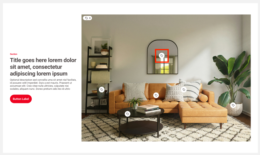 |
| Call To Action Button Text | Enter text appearing on the call-to-action button. This text is visible to the visitors to your site. |
Advanced
| Field | Description |
|---|---|
| Hide Title | Toggle on to suppress display of the asset's title. |
| Hide Description | Toggle on to hide the descriptions of the asset(s) contained in the module. |
| Hide Image | Toggle on to hide the image included on the asset contained in the module. |
| Hide Category | Toggle on to hide the category of the asset included in the module. |
Hotspot Module Styles
| Field | Description |
|---|---|
| Template | Select the template of this module from the list of options. Templates are visual presentation presets that differ depending on the type of module. |
| Preset | Select one of the following: - None—Applies styling from the site's theme. - Custom—Opens a form to customize the site's theme for this asset. - (Various)—Aside from None or Custom, there may be additional options in this list depending on the value selected in the Template field. If the selected template has presets, then those presets are able to be selected in this list and applied. For information about configuring template presets, see Creating a template preset. |
| Choose a Background Color | Enter the hexadecimal value of a background color for this module. For instance, entering #000888 provides a dark blue background. |
| Choose the Aspect Ration of the Main Image Hotspot Module | Select one of the available aspect ratios for the image in the module. |
| Module Padding Top | Overrides the default padding at the top of the module as specified in your theme's CSS file. You can choose from None, Small, Medium, or Large. |
| Module Padding Bottom | Overrides the default padding at the bottom of the module as specified in your theme's CSS file. You can choose from None, Small, Medium, or Large. |
| Use Text Colors | Select the color to use for text. - Standard—Use the text color specified in the site's theme. - Inverse—Use the inverse of the text color specified in the site's theme. |
| Color Scheme | Select the color scheme to use for this page. - Standard—Use the text color specified in the site's theme. - Inverse—Use the inverse of the text color specified in the site's theme. |
| Choose the Size of the Promos in the Hotspot Modal | Select a size of the promo modules that appear after clicking a hotspot. |
| Choose the Aspect Ratio of the Image of the Promos Modal | Select one of the available aspect ratios for the images of the promo modules that appear after clicking a hotspot. |
| Field | Description |
|---|---|
| Category | Enter text to override what appears as the eyebrow text when this promo appears on a page. |
| Anchor | Modify the anchor to something that would make sense when appearing in an Anchor field's drop-down menu on another asset. This allows you to directly link to this module in another asset. Being specific makes it easier to identify in a list of other anchors. |