Swatches
Swatches provide a convenient way for site designers to select colors that conform to a site’s branding. You can configure a default swatch for all sites, and designers later customize the swatch for each site as necessary.
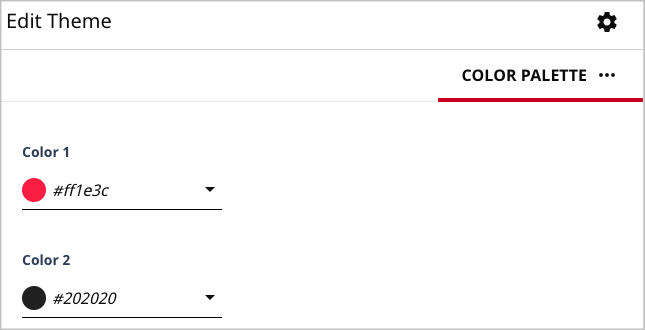
You configure the default swatch in the theme’s file styleguide/_colorPalette.config.json. The following snippet shows defaults for two colors in a swatch; you can define up to seven colors.
1{2"colorPalette": {3"colorOne": {4"type": "color",5"displayName": "Color 1",6"cms.ui.placeholder": "#ff1e3c"7},8"colorTwo": {9"type": "color",10"displayName": "Color 2",11"cms.ui.placeholder": "#202020"12}13}14}
At run time, when a designer opens the color picker, the swatch appears along with the hue and saturation controls.